uniapp微信小程序自定义导航栏的全过程
前言
相信很多小伙伴在使用uniapp进行多端开发的时候呢,在面对一些奇葩的业务需求的时候,uniapp给我们提供的默认导航栏已经不能满足我们的业务需求了,这个时候就需要我们自己自定义导航栏使用啦。
当然uniapp也给我们提供了很多的自定义导航栏的插件供大家使用,今天也给大家分享一个我自己写的导航栏啦,希望大家多多指点
首先我们在自定义导航栏的时候,我们需要知道头部的导航栏有哪几部分组成,那么我们以微信小程序为例
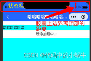
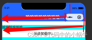
可以看到在微信小程序中,我们的头部导航栏其实受到右上角胶囊的限制比较大,这个时候我们自定义的导航栏,需要做到标题于胶囊水平对齐,那其实这个时候整个头部其实主要又:状态栏的高度+标题栏的高度组成。
状态栏的高度我们可以通过uni.getSystemInfoSync().statusBarHeight来获取。
那么标题栏的高度我们怎么获取呢?
其实要想定义标题栏的高度,我们需要知道这个胶囊的位置,在小程序中我们可以使用wx.getMenuButtonBoundingClientRect()获取关于胶囊的信息
获取到的胶囊的top,left,right分别对应胶囊的上边界,左边界,右边界相对于屏幕左上角的起点的位置,所以我们是不是可以用(胶囊上边界距离顶部的距离 - 状态栏的高度)*2+胶囊的高度,就是标题栏的高度呢?然后再在标题栏里面添加一个文本区让他的高度等于胶囊的高度,实现flex布局的上下居中是不是就搞定了呢?
以上呢其实针对小程序平台的导航栏讲解,那么既然使用uniapp,就会考虑到多端情况
那么其实我们使用uniapp获取到的状态栏在h5,小程序和app原生都是有效的,h5网页中一般我们都是直接采用浏览器内核给我们内置的网页导航栏,就是一个头部,没有过多的要求,而且浏览器不同,给我们提供的头部导航也不一样。
而对于app端,我们没有了像微信小程序中那种让人心烦的胶囊之后,我们只需要知道状态栏的高度,然后加上自己业务需求的标题栏样式和标题栏高度就行啦
所以我们在进行自定义导航栏封装的时候就要对代码进行条件编译啦。那么我这里呢是把微信小程序做了单独的处理,微信小程序之外的平台看作是统一状态
献上源码:
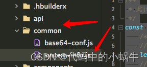
首先我们把获取设备信息的代码封装到一个统一的js文件里面,这样方便我们在组件中获取也方便我们在页面中获取。
/**
 * 此js文件管理关于当前设备的机型系统信息
 */
const systemInfo = function() {
	/****************** 所有平台共有的系统信息 ********************/
	// 设备系统信息
	let systemInfomations = uni.getSystemInfoSync()
	// 机型适配比例系数
	let scaleFactor = 750 / systemInfomations.windowWidth
	// 当前机型-屏幕高度
	let windowHeight = systemInfomations.windowHeight * scaleFactor //rpx
	// 当前机型-屏幕宽度
	let windowWidth = systemInfomations.windowWidth * scaleFactor //rpx
	// 状态栏高度
	let statusBarHeight = (systemInfomations.statusBarHeight) * scaleFactor //rpx

	// 导航栏高度  注意:此导航栏高度只针对微信小程序有效 其他平台如自定义导航栏请使用:状态栏高度+自定义文本高度
	let navHeight = 0 //rpx
	// console.log(windowHeight,'哈哈哈哈哈');

	/****************** 微信小程序头部胶囊信息 ********************/
	// #ifdef MP-WEIXIN
	const menuButtonInfo = wx.getMenuButtonBoundingClientRect()
	// 胶囊高度
	let menuButtonHeight = menuButtonInfo.height * scaleFactor //rpx
	// 胶囊宽度
	let menuButtonWidth = menuButtonInfo.width * scaleFactor //rpx
	// 胶囊上边界的坐标
	let menuButtonTop = menuButtonInfo.top * scaleFactor //rpx
	// 胶囊右边界的坐标
	let menuButtonRight = menuButtonInfo.right * scaleFactor //rpx
	// 胶囊下边界的坐标
	let menuButtonBottom = menuButtonInfo.bottom * scaleFactor //rpx
	// 胶囊左边界的坐标
	let menuButtonLeft = menuButtonInfo.left * scaleFactor //rpx

	// 微信小程序中导航栏高度 = 胶囊高度 + (顶部距离 - 状态栏高度) * 2
	navHeight = menuButtonHeight + (menuButtonTop - statusBarHeight) * 2
	// #endif


	// #ifdef MP-WEIXIN
	return {
		scaleFactor,
		windowHeight,
		windowWidth,
		statusBarHeight,
		menuButtonHeight,
		menuButtonWidth,
		menuButtonTop,
		menuButtonRight,
		menuButtonBottom,
		menuButtonLeft,
		navHeight
	}
	// #endif

	// #ifndef MP-WEIXIN
	return {
		scaleFactor,
		windowHeight,
		windowWidth,
		statusBarHeight
	}
	// #endif
}

export {
	systemInfo
}
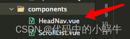
然后我们定义一个导航栏组件
/*
* 注意:
* 1、在传入宽度或者高度时,如果是Number数据,传入的值为px大小,无需带单位,组件自动计算
* 2、在使用此导航栏时,建议传入UI规定的导航栏高度,此高度只针对除微信小程序的其他平台有效,微信小程序的导航栏高度,组件自计算
*/
<template>
	<view>
		<!-- 微信小程序头部导航栏 -->
		<!-- #ifdef MP-WEIXIN -->
		<view class="wx-head-mod" :style="{height:navHeight+'rpx',backgroundColor:navBackgroundColor}">
			<view class="wx-head-mod-nav" :style="{height:navigationBarHeight+'rpx',top:statusBarHeight+'rpx'}">
				<view class="wx-head-mod-nav-content"
					:style="{height:customHeight+'rpx',justifyContent:textAlign === 'center'?'center':'left'}">
					<!-- 文本区 -->
					<view class="wx-head-mod-nav-content-mian"
						:style="{width:navTextWidth,lineHeight:customHeight + 'rpx',paddingLeft:textPaddingLeft*scaleFactor+'rpx',fontSize:fontSize*scaleFactor+'rpx',fontWeight:fontWeight,color:titleColor}">
						{{textContent}}
					</view>
					<!-- 返回按钮 -->
					<view class="wx-head-mod-nav-content-back" :style="{display:isBackShow?'flex':'none'}"
						@click="backEvent">
						<view class="wx-head-mod-nav-content-back-img"
							:style="{width:backImageWidth*scaleFactor+'rpx',height:backImageHeight*scaleFactor+'rpx'}">
							<image :src="backImageUrl" mode="" style="width: 100%;height: 100%;"></image>
						</view>
					</view>
				</view>
			</view>
		</view>
		<!-- #endif -->

		<!-- 除微信小程序之外的其他设备 -->
		<!-- #ifndef MP-WEIXIN -->
		<view class="other-head-mod"
			:style="{height:navHeightValue*scaleFactor+statusBarHeight+'rpx',backgroundColor:navBackgroundColor}">
			<view class="other-head-mod-mian"
				:style="{height:navHeightValue*scaleFactor+'rpx',justifyContent:textAlign === 'center'?'center':'left'}">
				<!-- 返回按钮 -->
				<view class="other-head-mod-mian-back" v-show="isBackShow" @click="backEvent">
					<view class="other-head-mod-mian-back-img"
						:style="{width:backImageWidth*scaleFactor+'rpx',height:backImageHeight*scaleFactor+'rpx'}">
						<image :src="backImageUrl" mode="" style="width: 100%;height: 100%;"></image>
					</view>
				</view>
				<!-- 标题 -->
				<view class="other-head-mod-mian-title" :style="{width:windowWidth - 184+'rpx',lineHeight:navHeightValue*scaleFactor+'rpx',
					paddingLeft:textPaddingLeft*scaleFactor+'rpx',fontSize:fontSize*scaleFactor+'rpx',
					fontWeight:fontWeight,color:titleColor}">
					{{textContent}}
				</view>
			</view>
		</view>
		<!-- #endif -->
	</view>
</template>

<script>
	const app = getApp()
	import {systemInfo} from '@/common/system-info.js'
	export default {
		name: "HeadView",
		props: {
			// 文本区域位置 left:左  center:中
			textAlign: {
				type: String,
				default: 'center'
			},
			// 文本区内容
			textContent: {
				type: String,
				default: '哈哈哈哈哈哈哈哈哈哈哈哈哈哈哈哈就啊哈哈好借好还'
			},
			// 文本区离左边的距离
			textPaddingLeft: {
				type: Number,
				default: 16
			},
			// 是否需要返回按钮
			isBackShow: {
				type: Boolean,
				default: true
			},
			// 文本区字体大小
			fontSize: {
				type: Number,
				default: 20 //px
			},
			// 文本区字体粗细
			fontWeight: {
				type: Number,
				default: 700
			},
			// 文本区返回按钮图片宽
			backImageWidth: {
				type: Number,
				default: 12 //px
			},
			// 文本区返回按钮图片高
			backImageHeight: {
				type: Number,
				default: 24 //px
			},
			// 返回按钮图标路径
			backImageUrl: {
				type: String,
				default: '/static/backImage.svg'
			},
			// 导航栏整体背景颜色
			navBackgroundColor: {
				type: String,
				default: '#2476F9'
			},
			// 标题字体颜色
			titleColor: {
				type: String,
				default: '#ffffff',
			},

			/******** h5端,app端需要传入自定义导航栏高度 *******/
			navHeightValue: {
				type: Number,
				default: 44 //px
			}
		},
		computed: {
			// 文本区宽度
			navTextWidth() {
				if (this.textAlign === 'center') {
					return (this.windowWidth - (this.windowWidth - this.menubarLeft) * 2) + 'rpx'
				} else {
					return this.menubarLeft + 'rpx'
				}
			},
			// 文本区paddingLeft
			textPaddingleft() {
				if (this.textAlign === 'center') {
					return '0'
				} else {
					return this.textPaddingLeft + 'rpx'
				}
			}
		},
		data() {
			return {
				statusBarHeight: app.globalData.statusBarHeight, //状态栏高度
				navHeight: app.globalData.navHeight, //头部导航栏总体高度
				navigationBarHeight: app.globalData.navigationBarHeight, //导航栏高度
				customHeight: app.globalData.customHeight, //胶囊高度
				scaleFactor: app.globalData.scaleFactor, //比例系数
				menubarLeft: app.globalData.menubarLeft, //胶囊定位的左边left
				windowWidth: app.globalData.windowWidth * app.globalData.scaleFactor
			};
		},
		methods: {
			backEvent() {
				uni.navigateBack({
					delta: 1
				})
			}
		},
		created() {
			/* 获取设备信息 */
			const SystemInfomations = systemInfo()
			/* 通用平台 */
			this.statusBarHeight = SystemInfomations.statusBarHeight //状态栏高度
			this.scaleFactor = SystemInfomations.scaleFactor //比例系数
			this.windowWidth = SystemInfomations.windowWidth //当前设备的屏幕宽度
			/* 微信小程序平台 */
			// #ifdef MP-WEIXIN
			this.navHeight = SystemInfomations.navHeight + SystemInfomations.statusBarHeight //头部导航栏总高度
			this.navigationBarHeight = SystemInfomations.navHeight //头部导航栏高度
			this.customHeight = SystemInfomations.menuButtonHeight //胶囊高度
			this.menubarLeft = SystemInfomations.menuButtonLeft //胶囊左边界距离左上角的距离
			// #endif

		}
	}
</script>

<style>
	/* #ifdef MP-WEIXIN */
	.wx-head-mod {
		box-sizing: border-box;
		width: 100%;
		position: fixed;
		top: 0;
		left: 0;
	}

	.wx-head-mod-nav {
		box-sizing: border-box;
		width: 100%;
		position: absolute;
		left: 0;
		display: flex;
		justify-content: center;
		align-items: center;

	}

	.wx-head-mod-nav-content {
		box-sizing: border-box;
		width: 100%;
		display: flex;
		justify-content: left;
		align-items: center;
		position: relative;
	}

	/* 文本区 */
	.wx-head-mod-nav-content-mian {
		box-sizing: border-box;
		height: 100%;
		white-space: nowrap;
		text-overflow: ellipsis;
		overflow: hidden;
	}

	/* 返回按钮 */
	.wx-head-mod-nav-content-back {
		box-sizing: border-box;
		width: 60rpx;
		height: 100%;
		/* background-color: aqua; */
		position: absolute;
		top: 0;
		left: 32rpx;
		display: flex;
		align-items: center;
		justify-content: left;
	}

	.wx-head-mod-nav-content-back-img {
		box-sizing: border-box;
	}

	/* #endif */

	/* #ifndef MP-WEIXIN */
	.other-head-mod {
		box-sizing: border-box;
		width: 100%;
		position: fixed;
		top: 0;
		left: 0;
	}

	.other-head-mod-mian {
		box-sizing: border-box;
		width: 100%;
		display: flex;
		align-items: center;
		justify-content: left;
		position: absolute;
		left: 0;
		bottom: 0;
	}

	/* 返回按钮 */
	.other-head-mod-mian-back {
		box-sizing: border-box;
		height: 100%;
		width: 60rpx;
		position: absolute;
		left: 32rpx;
		top: 0;
		display: flex;
		align-items: center;
	}

	/* 标题 */
	.other-head-mod-mian-title {
		box-sizing: border-box;
		height: 100%;
		white-space: nowrap;
		text-overflow: ellipsis;
		overflow: hidden;
	}

	/* #endif */
</style>
组件使用:
引入组件:
import HeadNav from '@/components/HeadNav.vue'
组册组件:
components:{
			HeadNav
		},
<template>
	<view class="content">
		<head-nav></head-nav>
		<view class="content-main"></view>
	</view>
</template>
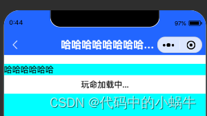
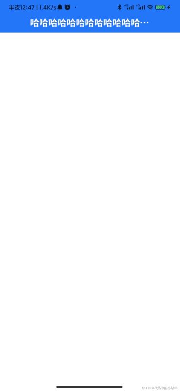
效果图:
微信小程序:
h5:
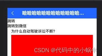
app:
在项目里面没有针对h5时候需要导航栏做特别的限制,如果实际开发中在h5端不需要此导航栏,请在模版上面针对h5页面加入条件编译即可。
总结
到此这篇关于uniapp微信小程序自定义导航栏的文章就介绍到这了,更多相关uniapp自定义导航栏内容请搜索猪先飞以前的文章或继续浏览下面的相关文章希望大家以后多多支持猪先飞!
原文出处:https://blog.csdn.net/weixin_55010007/article/details/124854
相关文章
- 这篇文章主要给大家介绍了关于C#创建自定义控件及添加自定义属性和事件使用的相关资料,文中通过示例代码介绍的非常详细,对大家学习或者使用C#具有一定的参考学习价值,需要的朋友们下面来一起学习学习吧...2020-06-25
- 本文实例讲述了JS实现自定义简单网页软键盘效果。分享给大家供大家参考,具体如下:这是一款自定义的简单点的网页软键盘,没有使用任何控件,仅是为了练习JavaScript编写水平,安全性方面没有过多考虑,有顾虑的可以不用,目的是学...2015-11-08
- 为了增强android应用的用户体验,我们可以在一些Button按钮上自定义动态的设置一些样式,比如交互时改变字体、颜色、背景图等。 今天来看一个通过重写Button来动态实...2016-09-20
- 这篇文章主要介绍了uniapp微信小程序:key失效的解决方法,文中通过示例代码介绍的非常详细,对大家的学习或者工作具有一定的参考学习价值,需要的朋友们下面随着小编来一起学习学习吧...2021-01-20
- 下面我们来看一篇关于Android自定义WebView网络视频播放控件开发例子,这个文章写得非常的不错下面给各位共享一下吧。 因为业务需要,以下代码均以Youtube网站在线视...2016-10-02
- 自定义一个jquery模态窗口插件,将它集成到现有平台框架中时,它只能在mainFrame窗口中显示,无法在顶层窗口显示. 解决这个问题的办法: 通过以下代码就可能实现在顶层窗口弹窗 复制代码 代码如下: $(window.top.documen...2014-05-31
- 这篇文章主要介绍了自定义feignClient的常见坑及解决方案,具有很好的参考价值,希望对大家有所帮助。如有错误或未考虑完全的地方,望不吝赐教...2021-10-20
- 今天小编就为大家分享一篇pytorch 自定义卷积核进行卷积操作方式,具有很好的参考价值,希望对大家有所帮助。一起跟随小编过来看看吧...2020-05-06
PHP YII框架开发小技巧之模型(models)中rules自定义验证规则
YII的models中的rules部分是一些表单的验证规则,对于表单验证十分有用,在相应的视图(views)里面添加了表单,在表单被提交之前程序都会自动先来这里面的规则里验证,只有通过对其有效的限制规则后才能被提交,可以很有效地保证...2015-11-24- 这篇文章主要介绍了jquery自定义插件开发之window的实现过程的相关资料,需要的朋友可以参考下...2016-05-09
- 本文主要介绍了手把手教你uniapp和小程序分包,文中通过示例代码介绍的非常详细,具有一定的参考价值,感兴趣的小伙伴们可以参考一下...2021-09-02
- 这篇文章主要为大家详细介绍了uniapp 实现可以左右滑动导航栏,文中示例代码介绍的非常详细,具有一定的参考价值,感兴趣的小伙伴们可以参考一下...2020-10-21
vue-admin-template配置快捷导航的代码(标签导航栏)
这篇文章主要介绍了vue-admin-template配置快捷导航的方法(标签导航栏),本文通过实例代码给大家介绍的非常详细,对大家学习或工作具有一定的参考借鉴价值,需要的朋友可以参考下...2020-09-04- 这篇文章主要介绍了C#自定义事件监听实现方法,涉及C#事件监听的实现技巧,具有一定参考借鉴价值,需要的朋友可以参考下...2020-06-25
- 这篇文章主要介绍了Vue 组件复用多次自定义参数操作,具有很好的参考价值,希望对大家有所帮助。一起跟随小编过来看看吧...2020-07-27
- 本文给大家介绍利用Vue实现tab导航栏,并且通过flex布局实现左右滑动效果,通过代码给大家分享tab导航栏布局的实现,本文给大家展示了完整代码,需要的朋友参考下吧...2021-06-28
- 这篇文章主要介绍了uniapp和vue的区别,文中通过示例代码介绍的非常详细,对大家的学习或者工作具有一定的参考学习价值,需要的朋友们下面随着小编来一起学习学习吧...2021-10-19
- 这篇文章主要介绍了使用BindingResult 自定义错误信息,具有很好的参考价值,希望对大家有所帮助。如有错误或未考虑完全的地方,望不吝赐教...2021-10-23
- 这篇文章主要介绍了在Vue中获取自定义属性方法:data-id的实例,具有很好的参考价值,希望对大家有所帮助。一起跟随小编过来看看吧...2020-09-09
- 一步步教大家编写酷炫的导航栏,js+css实现黑色经典导航栏,具有一定的参考价值,感兴趣的小伙伴们可以参考一下...2016-03-18