Thinkphp自定义美化success和error提示跳转页面代码实例
更新时间:2021年3月5日 20:48 点击:2241
先贴效果图:
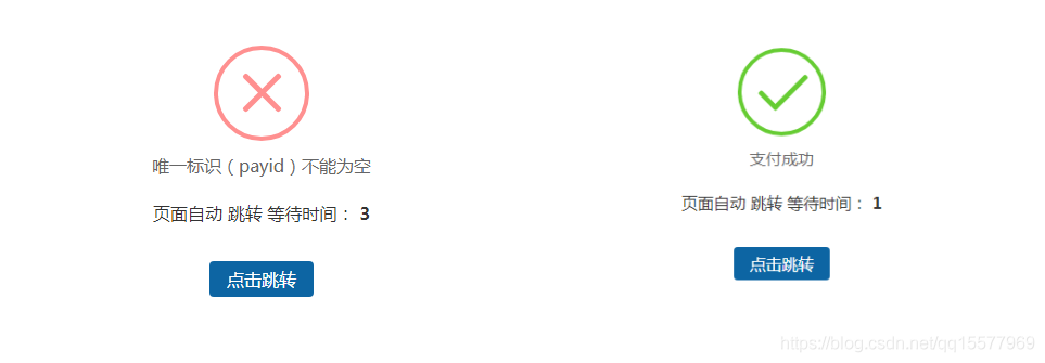
优点:图标是有动画效果的,不需要背景图片。
1、需要引用一个dialog.css,代码如下:
/* ===========================================
 @des:     dialog.less
 @author:   美奇软件开发工作室
 @QQ:     15577969
 @赞助平台:  元宝支付(18pay.net)
 @time:    2021-01-10
 =============================================*/

@charset "utf-8";
.clearfix {
 *zoom: 1;
}
.clearfix:after {
 visibility: hidden;
 display: block;
 font-size: 0;
 content: " ";
 clear: both;
 height: 0;
}
* {
 margin: 0;
 padding: 0;
}
ul,
ol {
 list-style: none;
}
img {
 border: none;
}
input,
select,
textarea {
 outline: none;
 border: none;
 background: none;
}
textarea {
 resize: none;
}
a {
 text-decoration: none;
}
.body {
 font-family: 14px "Microsoft Yahei", "微软雅黑", Arial, Tahoma;
}
.btn-container {
 width: 100%;
 display: flex;
 display: -webkit-flex;
 display: -moz-flex;
 justify-content: space-around;
 -webkit-justify-content: space-around;
 -moz-justify-content: space-around;
}
.btn-container input[type='button'] {
 width: 20%;
 padding: 0.357rem;
 color: #fff;
 border-radius: 3px;
 -webkit-radius: 3px;
 -moz-radius: 3px;
 background-color: #3B9DFF;
}
.btn-container input[type='button']:active {
 background-color: #1966b3;
}
/*重置盒模型 */
.boxContent * {
 box-sizing: content-box;
 -webkit-box-sizing: content-box;
 -moz-box-sizing: content-box;
}
/*animation start*/
#animationTipBox {
 width: 100%;
 height: auto;
 background-color: #fff;
 border-radius: 8px;
 -webkit-border-radius: 8px;
 -moz-border-radius: 8px;
 position: fixed;
 left: 50%;
 top: 30%;
 margin-left: -50%;
 margin-top: -75px;
 z-index: 1001;
 -webkit-animation: alertAnimation 0.3s ease-in-out 0s 1;
 -moz-animation: alertAnimation 0.3s ease-in-out 0s 1;
 animation: alertAnimation 0.3s ease-in-out 0s 1;
}
#animationTipBox * {
 box-sizing: content-box;
 -webkit-box-sizing: content-box;
 -moz-box-sizing: content-box;
}
#animationTipBox .icon {
 position: relative;
 width: 80px;
 height: 80px;
 border-radius: 50px;
 -webkit-border-radius: 50px;
 -moz-border-radius: 50px;
 border: 4px solid #66cc33;
 margin: 15px auto 5px auto;
}
#animationTipBox .icon_box {
 width: 80px;
 height: 80px;
 margin: 0 auto;
 text-align: center;
 position: relative;
}
#animationTipBox .lose .icon {
 border-color: #FF9090;
}
#animationTipBox .lose .icon_box {
 -webkit-animation: lose_Animation 0.5s ease 0s 1;
 -moz-animation: lose_Animation 0.5s ease 0s 1;
 animation: lose_Animation 0.5s ease 0s 1;
}
#animationTipBox .dec_txt {
 font-size: 16px;
 text-align: center;
 color: #666;
 line-height: 26px;
 height: 26px;
 padding: 5px 0 10px 0;
}
.tip .icon {
 width: 80px;
 height: 80px;
 background-color: #66cc33;
 border-radius: 100%;
 -webkit-border-radius: 100%;
 -moz-border-radius: 100%;
 color: #fff;
 font-size: 80px;
 text-align: center;
 line-height: 80px;
}
.success .line_short {
 width: 25px;
 height: 5px;
 position: absolute;
 left: 14px;
 top: 46px;
 border-radius: 4px;
 -webkit-border-radius: 4px;
 -moz-border-radius: 4px;
 background-color: #66cc33;
 transform: rotate(45deg);
 -webkit-transform: rotate(45deg);
 -moz-transform: rotate(45deg);
 -webkit-animation: success_short_Animation 0.65s ease 0s 1;
 -moz-animation: success_short_Animation 0.65s ease 0s 1;
 animation: success_short_Animation 0.65s ease 0s 1;
}
.success .line_long {
 width: 47px;
 height: 5px;
 position: absolute;
 right: 8px;
 top: 38px;
 border-radius: 4px;
 -webkit-border-radius: 4px;
 -moz-border-radius: 4px;
 background-color: #66cc33;
 transform: rotate(-45deg);
 -webkit-transform: rotate(-45deg);
 -moz-transform: rotate(-45deg);
 -webkit-animation: success_long_Animation 0.65s ease 0s 1;
 -moz-animation: success_long_Animation 0.65s ease 0s 1;
 animation: success_long_Animation 0.65s ease 0s 1;
}
.lose .line_left,
.lose .line_right {
 width: 47px;
 height: 5px;
 position: absolute;
 left: 17px;
 top: 37px;
 border-radius: 4px;
 -webkit-border-radius: 4px;
 -moz-border-radius: 4px;
 background-color: #FF9090;
 transform: rotate(45deg);
 -webkit-transform: rotate(45deg);
 -moz-transform: rotate(45deg);
}
.lose .line_right {
 right: 11px;
 top: 37px;
 transform: rotate(-45deg);
 -webkit-transform: rotate(-45deg);
 -moz-transform: rotate(-45deg);
}
/* 总体动画 函数 */
/*all animate*/
@-webkit-keyframes alertAnimation {
 0% {
  -webkit-transform: scale(0.5);
 }
 45% {
  -webkit-transform: scale(1.25);
 }
 80% {
  -webkit-transform: scale(0.95);
 }
 100% {
  -webkit-transform: scale(1);
 }
}
@-moz-keyframes alertAnimation {
 0% {
  -webkit-transform: scale(0.5);
 }
 45% {
  -webkit-transform: scale(1.25);
 }
 80% {
  -webkit-transform: scale(0.95);
 }
 100% {
  -webkit-transform: scale(1);
 }
}
@-webkit-keyframes alertAnimation {
 0% {
  -webkit-transform: scale(0.5);
 }
 45% {
  -webkit-transform: scale(1.25);
 }
 80% {
  -webkit-transform: scale(0.95);
 }
 100% {
  -webkit-transform: scale(1);
 }
}
/*all animate*/
/*success short animate*/
@-webkit-keyframes success_short_Animation {
 0% {
  width: 0;
  left: 1px;
  top: 19px;
 }
 54% {
  width: 0;
  left: 1px;
  top: 19px;
 }
 70% {
  width: 50px;
  left: -4px;
  top: 37px;
 }
 84% {
  width: 17px;
  left: 21px;
  top: 48px;
 }
 100% {
  width: 25px;
  left: 14px;
  top: 45px;
 }
}
@-moz-keyframes success_short_Animation {
 0% {
  width: 0;
  left: 1px;
  top: 19px;
 }
 54% {
  width: 0;
  left: 1px;
  top: 19px;
 }
 70% {
  width: 50px;
  left: -4px;
  top: 37px;
 }
 84% {
  width: 17px;
  left: 21px;
  top: 48px;
 }
 100% {
  width: 25px;
  left: 14px;
  top: 45px;
 }
}
@-webkit-keyframes success_short_Animation {
 0% {
  width: 0;
  left: 1px;
  top: 19px;
 }
 54% {
  width: 0;
  left: 1px;
  top: 19px;
 }
 70% {
  width: 50px;
  left: -4px;
  top: 37px;
 }
 84% {
  width: 17px;
  left: 21px;
  top: 48px;
 }
 100% {
  width: 25px;
  left: 14px;
  top: 45px;
 }
}
/*success short animate*/
/*success long animate*/
@-webkit-keyframes success_long_Animation {
 0% {
  width: 0;
  right: 46px;
  top: 54px;
 }
 65% {
  width: 0;
  right: 46px;
  top: 54px;
 }
 84% {
  width: 55px;
  right: 0px;
  top: 35px;
 }
 100% {
  width: 47px;
  right: 8px;
  top: 38px;
 }
}
@-moz-keyframes success_long_Animation {
 0% {
  width: 0;
  right: 46px;
  top: 54px;
 }
 65% {
  width: 0;
  right: 46px;
  top: 54px;
 }
 84% {
  width: 55px;
  right: 0px;
  top: 35px;
 }
 100% {
  width: 47px;
  right: 8px;
  top: 38px;
 }
}
@-webkit-keyframes success_long_Animation {
 0% {
  width: 0;
  right: 46px;
  top: 54px;
 }
 65% {
  width: 0;
  right: 46px;
  top: 54px;
 }
 84% {
  width: 55px;
  right: 0px;
  top: 35px;
 }
 100% {
  width: 47px;
  right: 8px;
  top: 38px;
 }
}
/*success long animate*/
/*load_Animation*/
@-webkit-keyframes load_Animation {
 0% {
  -webkit-transform: scale(0.6);
  opacity: 0.2;
 }
 50% {
  -webkit-transform: scale(0.6);
  opacity: 0.5;
 }
 80% {
  -webkit-transform: scale(1.15);
  opacity: 0.8;
 }
 100% {
  -webkit-transform: scale(1);
  opacity: 1.0;
 }
}
@-moz-keyframes load_Animation {
 0% {
  -webkit-transform: scale(0.6);
  opacity: 0.2;
 }
 50% {
  -webkit-transform: scale(0.6);
  opacity: 0.5;
 }
 80% {
  -webkit-transform: scale(1.15);
  opacity: 0.8;
 }
 100% {
  -webkit-transform: scale(1);
  opacity: 1.0;
 }
}
@-webkit-keyframes load_Animation {
 0% {
  -webkit-transform: scale(0.6);
  opacity: 0.2;
 }
 50% {
  -webkit-transform: scale(0.6);
  opacity: 0.5;
 }
 80% {
  -webkit-transform: scale(1.15);
  opacity: 0.8;
 }
 100% {
  -webkit-transform: scale(1);
  opacity: 1.0;
 }
}
/*load_Animation*/
/*lose_Animation*/
@-webkit-keyframes lose_Animation {
 0% {
  -webkit-transform: scale(0.6);
  opacity: 0.2;
 }
 50% {
  -webkit-transform: scale(0.6);
  opacity: 0.5;
 }
 80% {
  -webkit-transform: scale(1.15);
  opacity: 0.8;
 }
 100% {
  -webkit-transform: scale(1);
  opacity: 1.0;
 }
}
@-moz-keyframes lose_Animation {
 0% {
  -webkit-transform: scale(0.6);
  opacity: 0.2;
 }
 50% {
  -webkit-transform: scale(0.6);
  opacity: 0.5;
 }
 80% {
  -webkit-transform: scale(1.15);
  opacity: 0.8;
 }
 100% {
  -webkit-transform: scale(1);
  opacity: 1.0;
 }
}
@-webkit-keyframes lose_Animation {
 0% {
  -webkit-transform: scale(0.6);
  opacity: 0.2;
 }
 50% {
  -webkit-transform: scale(0.6);
  opacity: 0.5;
 }
 80% {
  -webkit-transform: scale(1.15);
  opacity: 0.8;
 }
 100% {
  -webkit-transform: scale(1);
  opacity: 1.0;
 }
}
/*lose_Animation*/
.load {
 position: relative;
 width: 60px;
 height: 80px;
 border-radius: 50px;
 -webkit-border-radius: 50px;
 -moz-border-radius: 50px;
 border: 4px solid #fff;
 margin: 15px auto 5px auto;
 top: 10px;
}
.load .icon_box {
 margin: 10px auto;
 width: 60px;
 height: 60px;
}
.load .cirBox1,
.load .cirBox2,
.load .cirBox3 {
 width: 60px;
 height: 60px;
 position: absolute;
 left: 0;
 top: 0;
}
.load .cirBox1 > div,
.load .cirBox2 > div,
.load .cirBox3 > div {
 width: 10px;
 height: 10px;
 border-radius: 100%;
 -webkit-border-radius: 100%;
 -moz-border-radius: 100%;
 background-color: #ccc;
 position: absolute;
}
.load .cirBox1 {
 transform: rotate(30deg);
 -webkit-transform: rotate(30deg);
 -moz-transform: rotate(30deg);
}
.load .cirBox2 {
 transform: rotate(60deg);
 -webkit-transform: rotate(60deg);
 -moz-transform: rotate(60deg);
}
.load .cirBox3 {
 transform: rotate(90deg);
 -webkit-transform: rotate(90deg);
 -moz-transform: rotate(90deg);
}
.load .cir1 {
 left: 0;
 top: 0;
}
.load .cir2 {
 right: 0;
 top: 0;
}
.load .cir3 {
 right: 0;
 bottom: 0;
}
.load .cir4 {
 left: 0;
 bottom: 0;
}
.load .cir1,
.load .cir2,
.load .cir3,
.load .cir4 {
 -webkit-animation: cir_Animation 1.2s ease 0s infinite;
 -moz-animation: cir_Animation 1.2s ease 0s infinite;
 animation: cir_Animation 1.2s ease 0s infinite;
}
.cirBox1 .cir2 {
 -webkit-animation-delay: -1.1s;
 -moz-animation-delay: -1.1s;
 animation-delay: -1.1s;
}
.cirBox1 .cir3 {
 -webkit-animation-delay: -0.8s;
 -moz-animation-delay: -0.8s;
 animation-delay: -0.8s;
}
.cirBox1 .cir4 {
 -webkit-animation-delay: -0.5s;
 -moz-animation-delay: -0.5s;
 animation-delay: -0.5s;
}
.cirBox2 .cir2 {
 -webkit-animation-delay: -1s;
 -moz-animation-delay: -1s;
 animation-delay: -1s;
}
.cirBox2 .cir3 {
 -webkit-animation-delay: -0.7s;
 -moz-animation-delay: -0.7s;
 animation-delay: -0.7s;
}
.cirBox2 .cir4 {
 -webkit-animation-delay: -0.4s;
 -moz-animation-delay: -0.4s;
 animation-delay: -0.4s;
}
.cirBox3 .cir2 {
 -webkit-animation-delay: -0.9s;
 -moz-animation-delay: -0.9s;
 animation-delay: -0.9s;
}
.cirBox3 .cir3 {
 -webkit-animation-delay: -0.6s;
 -moz-animation-delay: -0.6s;
 animation-delay: -0.6s;
}
.cirBox3 .cir4 {
 -webkit-animation-delay: -0.3s;
 -moz-animation-delay: -0.3s;
 animation-delay: -0.3s;
}
@-webkit-keyframes cir_Animation {
 0%,
 80%,
 100% {
  -webkit-transform: scale(0.4);
 }
 40% {
  -webkit-transform: scale(1);
 }
}
@-moz-keyframes cir_Animation {
 0%,
 80%,
 100% {
  -webkit-transform: scale(0.4);
 }
 40% {
  -webkit-transform: scale(1);
 }
}
@-webkit-keyframes cir_Animation {
 0%,
 80%,
 100% {
  -webkit-transform: scale(0.4);
 }
 40% {
  -webkit-transform: scale(1);
 }
}
.mask {
 width: 100%;
 height: 100%;
 background-color: #000;
 opacity: .8;
 position: fixed;
 left: 0;
 top: 0;
 z-index: 1000;
}
2、修改application/config.php里,默认跳转页面对应的模板文件
// 视图输出字符串内容替换
'view_replace_str'    => ['__STATIC__'=>'/static'],
// 默认跳转页面对应的模板文件
//'dispatch_success_tmpl' => THINK_PATH . 'tpl' . DS . 'dispatch_jump.tpl',
//'dispatch_error_tmpl'  => THINK_PATH . 'tpl' . DS . 'dispatch_jump.tpl',
'dispatch_success_tmpl' => THINK_PATH . 'tpl' . DS .'default_jump.tpl',
'dispatch_error_tmpl'  => THINK_PATH . 'tpl' . DS .'default_jump.tpl',
3、在thinkphp/tpl目录下新建一个default_jump.tpl,代码如下:
{__NOLAYOUT__}<!DOCTYPE html PUBLIC "-//W3C//DTD XHTML 1.0 Transitional//EN" "http://www.w3.org/TR/xhtml1/DTD/xhtml1-transitional.dtd">
<html xmlns="http://www.w3.org/1999/xhtml">
<head>
  <meta http-equiv="Content-Type" content="text/html; charset=utf-8" />
  <meta name="viewport" content="width=device-width,initial-scale=1.0,minimum-scale=1.0,maximum-scale=1.0,user-scalable=no"/>
  <title>跳转提示</title>
	<!--引入dialog.css样式-->
  <link rel="stylesheet" href="__STATIC__/css/dialog.css" rel="external nofollow" >
  <style type="text/css">
		.system-message p{ text-align: center;}
		.system-message .jump{ padding-top: 10px}
		.system-message .jump a{ color: #333;}
		.system-message .jump-btn{margin-top: 40px}
		.system-message .jump-btn a{font-size: 16px;color: #fff;border-radius: 4px;background-color: #0d65a3;padding: 6px 16px;text-decoration: none;}
	</style>
</head>
<body>
  <div class="system-message">
		<div id='animationTipBox'>
    <?php switch ($code) {?>
      <?php case 1:?>
			<!--成功-->
				<div class='success'>
				  <div class='icon'>
					  <div class='icon_box'>
						  <div class='line_short'></div>
						  <div class='line_long'></div>
					  </div>
				  </div>
					<div class='dec_txt'><?php echo(strip_tags($msg));?></div>
				</div>
      <?php break;?>
      <?php case 0:?>
			<!--错误-->
				<div class='lose'>
				  <div class='icon'>
					  <div class='icon_box'>
						  <div class='line_left'></div>
						  <div class='line_right'></div>
					  </div>
				  </div>
					<div class='dec_txt'><?php echo(strip_tags($msg));?></div>
				</div>
      <?php break;?>
    <?php } ?>
			<p class="jump">
				页面自动<a id="href" href="<?php echo($url);?>" rel="external nofollow" >跳转</a> 等待时间: <b id="wait"><?php echo($wait);?></b>
			</p>
			<p class="jump-btn"><a id="href" href="<?php echo($url); ?>" rel="external nofollow" >点击跳转</a></p>
		</div>
  </div>
  <script type="text/javascript">
    (function(){
      var wait = document.getElementById('wait'),
        href = document.getElementById('href').href;
      var interval = setInterval(function(){
        var time = --wait.innerHTML;
        if(time <= 0) {
          location.href = href;
          clearInterval(interval);
        };
      }, 1000);
    })();
  </script>
</body>
</html>
注意:dialog.css的路径要根据你自己的网站来写
到此这篇关于Thinkphp自定义美化success和error提示跳转页面代码实例的文章就介绍到这了,更多相关Thinkphp自定义美化success和error提示跳转页面内容请搜索猪先飞以前的文章或继续浏览下面的相关文章希望大家以后多多支持猪先飞!
上一篇: ThinkPHP菜单无极分类实例讲解
相关文章
php错误提示 open_basedir restriction in effect 解决
今天在帮助一个朋友配置一台服务器时发现网站配置好了缓存目录读写不成功,在打开错误时发现提示 Warning: file_exists() [function.file-exists]: open_basedir restr...2016-11-25- 这篇文章主要介绍了解决Antd Table表头加Icon和气泡提示的坑,具有很好的参考价值,希望对大家有所帮助。一起跟随小编过来看看吧...2020-11-17
mysql提示Changed limits: max_open_files: 2048 max_connections: 1910 table_cache: 64的解决
在windows下安装Mysql系统日志出现max_open_files: 2048 max_connections: 510 table_cache: 764 类似错误是因为 max_connections 最大连接数和max_open_files、table_cache 不匹配。适当的降低max_connections 或调...2014-05-31- 有时候我们需要在登陆表单有一些提示语言,比如“请输入用户名”和“请输入密码”等语言,通过本文给大家介绍JavaScript实现输入框(密码框)出现提示语的相关知识,对js实现输入框提示相关知识感兴趣的朋友一起学习吧...2016-01-14
详解pycharm的python包opencv(cv2)无代码提示问题的解决
这篇文章主要介绍了详解pycharm的python包opencv(cv2)无代码提示问题的解决,文中通过示例代码介绍的非常详细,对大家的学习或者工作具有一定的参考学习价值,需要的朋友们下面随着小编来一起学习学习吧...2021-01-29ThinkPHP使用心得分享-ThinkPHP + Ajax 实现2级联动下拉菜单
首先是数据库的设计。分类表叫cate.我做的是分类数据的二级联动,数据需要的字段有:id,name(中文名),pid(父id). 父id的设置: 若数据没有上一级,则父id为0,若有上级,则父id为上一级的id。数据库有内容后,就可以开始写代码,进...2014-05-31- 这篇文章主要为大家分享了js滑动提示效果代码,实现方法简单,感兴趣的小伙伴们可以参考一下...2016-03-12
- 这篇文章主要为大家详细介绍了原生JS实现登录框邮箱提示,文中示例代码介绍的非常详细,具有一定的参考价值,感兴趣的小伙伴们可以参考一下...2021-10-18
- 这篇文章主要介绍了thinkPHP中多维数组的遍历方法,以简单实例形式分析了thinkPHP中foreach语句的使用技巧,需要的朋友可以参考下...2016-01-12
- 这篇文章主要介绍了jQuery文字提示与图片提示效果实现方法,涉及jQuery针对鼠标事件的响应与页面元素动态操作相关技巧,需要的朋友可以参考下...2016-07-06
- 下面小编就为大家带来一篇thinkphp自定义权限管理之名称判断方法。小编觉得挺不错的,现在就分享给大家,也给大家做个参考。一起跟随小编过来看看吧...2017-04-03
- 本文详细介绍了ThinkPHP使用方法,不懂的同学快来跟小编一起看看吧 1、下载ThinkPHP模板,整个导入到项目根目录下。2、修改index.php文件,内容如下:<?php/***临时配置,...2017-07-06
Notice:undefined index ..错误提示解决方法
这句是在php开发中会碰的一些问题,看这提示我们都知道是变量未定义,那么下面来解决Notice:undefined index方法, 一,这个因为是变量未定义我们只要找到相关的位置加...2016-11-25photoshop提示暂存盘已满怎么办?ps提示暂存盘已满如何解决
photoshop提示暂存盘已满怎么办呢?有一些设计在使用ps打开或处理图片时提示暂存盘已满了,那么此问题要如何解决呢?下面和一聚教程小编一起来看看吧。 第一步、我们...2016-09-14thinkphp3.x连接mysql数据库的方法(具体操作步骤)
这篇文章主要介绍了thinkphp3.x连接mysql数据库的方法,详细分析了thinkPHP3.x操作数据库的具体步骤,包括惯例配置文件设置,sql语句创建表以及针对数据库的数据插入操作等,需要的朋友可以参考下...2016-05-20- 这篇文章主要介绍了ThinkPHP 3.2.2实现事务操作的方法,简单分析了thinkPHP中事务的启动、提交、回滚等操作方法并给出了完整的事务提交与回滚操作实例,需要的朋友可以参考下...2017-05-08
ThinkPhP+Apache+PHPstorm整合框架流程图解
这篇文章主要介绍了ThinkPhP+Apache+PHPstorm整合框架流程图解,文中通过示例代码介绍的非常详细,对大家的学习或者工作具有一定的参考学习价值,需要的朋友可以参考下...2020-11-23- 这篇文章主要介绍了Element Tooltip 文字提示的使用示例,文中通过示例代码介绍的非常详细,对大家的学习或者工作具有一定的参考学习价值,需要的朋友们下面随着小编来一起学习学习吧...2020-07-26
- 这篇文章主要介绍了thinkPHP查询方式,结合实例形式总结分析了thinkPHP的普通查询、表达式查询、区间查询、统计查询及SQL直接查询的使用技巧,需要的朋友可以参考下...2016-01-12
- Gridview的链接和删除点击提示有利于提醒用户确认下操作是否正确,以免造成不必要的损失,感兴趣的朋友可以参考下,希望对你有所帮助...2021-09-22