vue中的slot封装组件弹窗
更新时间:2022年5月27日 23:14 点击:1050 作者:景尘
slot封装组件弹窗
<template>
  <el-dialog :title="title" :visible.sync="dialogVisible" :width="width" center>
    <slot name="content"></slot>
  </el-dialog>
</template>
<script>
export default {
  props: ["title", "width", "dialogVisible"],
  data() {
    return {};
  }
};
</script>
<style lang="less">
.el-dialog__header {
  padding: 20px 20px 10px;
  display: none;
}
.el-dialog__body {
  padding: 0px !important;
}
</style>
 <!-- 弹窗 -->
        <DialogModal :width="'552px'" :title="'加入黑名单'" :dialogVisible="centerDialogVisible">
          <div slot="content" class="popup">
            <div class="head">
              加入黑名单
              <i class="el-icon-close" @click="handelCloseModal()"></i>
            </div>
            <p class="isAdd">确定要讲客户王佳琛加入甄别黑名单?</p>
            <div class="confirm">
              <el-button type="primary">确定</el-button>
              <el-button plain>取消</el-button>
            </div>
          </div>
        </DialogModal>

        <!-- 弹窗 -->
vue组件slot入门---弹窗组件
slot 即插槽,相当于在子组件的 DOM 中留一个位置,父组件如果有需要,就可以在插槽里添加内容。
插槽的基础使用
这里是一个插槽的简单用法。
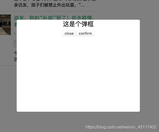
1.在子组件 Modal.vue 中用 slot 标签预留一个位置,slot 标签中的内容是后备内容,也可以为空:
<div class="modal-content">
  <slot>这是个弹框</slot>
  <div class="footer">
    <button @click="close">close</button>
    <button @click="confirm">confirm</button>
  </div>
</div>
后备内容:当父组件不在插槽里添加内容时,插槽显示的内容。
2.在父组件中使用子组件
在父组件中使用子组件,但不向自定义组件的插槽 slot 中添加内容:
<Modal :visible.sync="visible"></Modal>
此时如果打开弹框,弹框中显示的是后备内容“这是个弹框”:
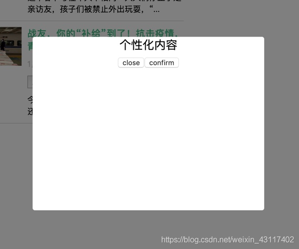
在父组件中使用子组件,并给插槽加入个性化内容:
<Modal :visible.sync="visible">个性化内容</Modal>
此时如果打开弹框,弹框中显示的是“个性化内容”:
弹窗组件
父App.vue
<template>
  <div id="app">
    <button @click="visible = true" class="btn">打开“留言”弹框</button>
    <button @click="visibleApply = true" class="btn">打开“成为大牛”弹框</button>
    <!-- “留言”弹框 -->
    <Modal
      customClassName="textarea-modal"
      title="留言"
      :visible.sync="visible"
      @confirm="confirm"
    >
      <template>
        <div class="txt">留下你想告诉我们的话...</div>
        <textarea
          name=""
          id=""
          cols="30"
          rows="10"
          placeholder="请写下您的宝贵意见"
        ></textarea>
      </template>
    </Modal>
    <!-- “成为大牛”弹框 -->
    <Modal
      customClassName="apply-modal"
      title="成为大牛"
      :visible.sync="visibleApply"
      @confirm="confirm"
    >
      <template>
        <div class="txt">留下联系方式,立即成为大牛</div>
        <div class="mobile">
          <input type="text" placeholder="请输入您的手机号码" />
        </div>
        <div class="code">
          <input type="text" placeholder="请输入验证码" />
          <button class="btn-code">获取验证码</button>
        </div>
      </template>
    </Modal>
  </div>
</template>
<script>
// 引入组件
import Modal from './components/Modal.vue';
export default {
  name: 'app',
  // 注册组件
  components: {
    Modal
  },
  data: function() {
    return {
      // 控制“留言”弹框
      visible: false,
      // 控制“成为大牛”弹框
      visibleApply: false
    };
  },
  methods: {
    // 自定义函数 confirm
    confirm() {
      // todo
    }
  }
};
</script>
<style lang="scss">
#app {
  font-family: 'Avenir', Helvetica, Arial, sans-serif;
  -webkit-font-smoothing: antialiased;
  -moz-osx-font-smoothing: grayscale;
  text-align: center;
  color: #2c3e50;
  margin-top: 60px;
}
.btn {
  width: fit-content;
  height: 40px;
  font-size: 15px;
  line-height: 40px;
  box-sizing: border-box;
  cursor: pointer;
  border: none;
  background: #ffffff;
  border: 1px solid #ebebeb;
  color: #1b1b1b;
  padding: 0 20px;
  margin-right: 20px;
  &:focus {
    outline: none;
  }
}
.textarea-modal {
  .txt {
    text-align: left;
    padding-top: 20px;
    font-size: 16px;
    line-height: 22px;
    color: #000000;
  }
  textarea {
    width: 355px;
    height: 110px;
    border: 1px solid #e6e6e6;
    font-size: 16px;
    line-height: 22px;
    color: #000000;
    padding: 14px 20px;
    box-sizing: border-box;
    margin-top: 18px;
    &::placeholder {
      color: rgba(0, 0, 0, 0.2);
    }
    &:focus {
      outline: none;
    }
  }
}
.apply-modal {
  .txt {
    text-align: left;
    padding-top: 20px;
    font-size: 16px;
    line-height: 22px;
    color: #000000;
    margin-bottom: 18px;
  }
  .mobile input,
  .code input {
    width: 355px;
    height: 50px;
    background: #ffffff;
    border: 1px solid #eeeeee;
    font-size: 16px;
    color: #000000;
    padding: 14px 20px;
    box-sizing: border-box;
    &::placeholder {
      color: rgba(0, 0, 0, 0.2);
    }
    &:focus {
      outline: none;
    }
  }
  .code {
    margin-top: 20px;
    position: relative;
    input {
      padding-right: 120px;
    }
    .btn-code {
      height: 50px;
      padding: 0 20px;
      font-size: 14px;
      line-height: 50px;
      color: #2c3744;
      background: none;
      border: none;
      position: absolute;
      top: 0;
      right: 0;
      &:focus {
        outline: none;
      }
      &::before {
        content: '';
        display: block;
        width: 1px;
        height: 20px;
        background: #e5e5e5;
        position: absolute;
        left: 0;
        top: 15px;
      }
    }
  }
}
</style>
子Modal.vue
<template>
  <div :class="['modal', customClassName]" v-if="visible">
    <div class="modal-content">
      <div class="modal-header">
        <div class="title">{{title}}</div>
        <button class="btn-close" @click="close"></button>
      </div>
      <div class="modal-body">
        <slot></slot>
      </div>
      <div class="modal-footer">
        <button class="btn-close" @click="close">取消</button>
        <button class="btn-confirm" @click="confirm">提交</button>
      </div>
    </div>
  </div>
</template>
<script>
export default {
  name: 'Modal',
  // customClassName 为自定义类名
  // title 为弹框标题
  props: ['visible', 'title', 'customClassName'],
  methods: {
    close() {
      this.$emit('update:visible', false);
    },
    confirm() {
      console.log('confirm');
      this.close();
    }
  }
};
</script>
<style lang="scss" scoped>
.modal {
  position: fixed;
  top: 0;
  bottom: 0;
  left: 0;
  right: 0;
  background: rgba(#000, 0.5);
  display: flex;
  align-items: center;
  justify-content: center;
  .modal-content {
    width: 415px;
    background: #fff;
    border-radius: 12px;
    text-align: center;
    .modal-header {
      height: 65px;
      position: relative;
      font-weight: 500;
      font-size: 18px;
      line-height: 65px;
      color: #000000;
      border-bottom: 1px solid #f2f2f2;
      .btn-close {
        width: 16px;
        height: 16px;
        background: url(https://qgt-document.oss-cn-beijing.aliyuncs.com/P3-5-Vue/5/5-1-1.png)
          no-repeat center / contain;
        position: absolute;
        top: 23px;
        right: 30px;
        border: none;
        cursor: pointer;
        &:focus {
          outline: none;
        }
      }
    }
    .modal-body {
      padding: 0 30px;
      font-size: 0;
    }
    .modal-footer {
      padding: 30px;
      display: flex;
      justify-content: space-between;
      .btn-close,
      .btn-confirm {
        width: 125px;
        height: 40px;
        font-size: 15px;
        line-height: 40px;
        box-sizing: border-box;
        cursor: pointer;
        border: none;
        &:focus {
          outline: none;
        }
      }
      .btn-close {
        background: #ffffff;
        border: 1px solid #ebebeb;
        color: #1b1b1b;
      }
      .btn-confirm {
        background: #3ab599;
        color: #fff;
      }
    }
  }
}
</style>
以上为个人经验,希望能给大家一个参考,也希望大家多多支持猪先飞。
原文出处:https://liulibin.blog.csdn.net/article/details/86543311
相关文章
基于vue-simple-uploader封装文件分片上传、秒传及断点续传的全局上传插件功能
这篇文章主要介绍了基于vue-simple-uploader封装文件分片上传、秒传及断点续传的全局上传插件,本文给大家介绍的非常详细,对大家的学习或工作具有一定的参考借鉴价值,需要的朋友可以参考下...2021-02-23- 这篇文章主要介绍了Vue组件跨层级获取组件操作,具有很好的参考价值,希望对大家有所帮助。一起跟随小编过来看看吧...2020-07-28
- 今天我们来给大家介绍下在Vue开发中我们经常会碰到的一种需求场景,本文主要介绍了Vue动态查询规则生成组件,需要的朋友们下面随着小编来一起学习学习吧...2021-05-27
- 这篇文章主要介绍了js组件SlotMachine实现图片切换效果制作抽奖系统的相关资料,需要的朋友可以参考下...2016-04-19
- 这篇文章主要介绍了vue中如何使用element的日历组件,本文通过实例代码给大家介绍的非常详细,对大家的学习或工作具有一定的参考借鉴价值,需要的朋友可以参考下...2021-09-30
- 这篇文章主要介绍了vue中实现点击空白区域关闭弹窗的两种方法,帮助大家更好的理解和使用vue框架,感兴趣的朋友可以了解下...2020-12-30
- 这篇文章主要介绍了Vue 过渡(动画)transition组件案例详解,非常不错,具有参考借鉴价值,需要的朋友参考下...2017-01-26
- 这篇文章主要介绍了Vue多选列表组件深入详解,这个是vue的基本组件,有需要的同学可以研究下...2021-03-03
- 在本篇内容里小编给大家分享的是关于c#使用封装方法以及相关知识点,对此有需要的朋友们可以学习下。...2020-06-25
- 这篇文章主要为大家详细介绍了vue递归实现自定义tree组件,文中示例代码介绍的非常详细,具有一定的参考价值,感兴趣的小伙伴们可以参考一下...2021-08-20
- 在网页中,经常见到进度条效果,那么这些个性的进度条组件效果是怎么实现的呢,下面脚本之家小编给大家分享Bootstrap进度条组件知识详解,感兴趣的朋友要求学习吧...2016-05-04
- 这篇文章主要介绍了Vue 组件复用多次自定义参数操作,具有很好的参考价值,希望对大家有所帮助。一起跟随小编过来看看吧...2020-07-27
- 这篇文章主要介绍了vue+element-ui表格封装tag标签使用插槽,文中通过示例代码介绍的非常详细,对大家的学习或者工作具有一定的参考学习价值,需要的朋友们下面随着小编来一起学习学习吧...2020-06-19
- 这篇文章主要介绍了Vue父子组件传值的一些坑,帮助大家更好的理解和使用vue父子组件,感兴趣的朋友可以了解下...2020-09-16
- 这篇文章主要介绍了Vue封装全局过滤器Filters的步骤,通过封装vue全局过滤器实现filters的统一管理。感兴趣的朋友可以了解下...2020-09-16
使用Angular CDK实现一个Service弹出Toast组件功能
本文主要写用cdk实现一个简单的Toast组件,使用的是cdk中的overlay模块,需要手动安装环境,具体安装方法及相关实现代码跟随小编一起看看吧...2021-07-28- 这篇文章主要介绍了封装 axios+promise通用请求函数操作,具有很好的参考价值,希望对大家有所帮助。一起跟随小编过来看看吧...2020-08-12
- 这篇文章主要介绍了vue 将多个过滤器封装到一个文件中实现方法,本文给大家介绍的非常详细,对大家的学习或工作具有一定的参考借鉴价值,需要的朋友参考下吧...2020-09-05
- 这篇文章主要为大家详细介绍了Bootstarp创建可折叠组件的对应方法,以实例为大家分享了Bootstrap折叠组件,感兴趣的小伙伴们可以参考一下...2016-02-26
- 这篇文章主要为大家详细介绍了原生JS封装Ajax插件,为大家介绍不同域之间互相请求资源的跨域...2016-05-05