vue大屏展示适配的方法
更新时间:2021年10月25日 12:00 点击:3184 作者:weixin_43859882
本文实例为大家分享了vue大屏展示适配的具体代码,供大家参考,具体内容如下
1.utils文件夹建一个文件cv以下代码
export function useIndex (appRef) {
  // * appRef指向最外层容器

  // * 定时函数
  let timer = null
  // * 默认缩放值
  const scale = {
    width: '1',
    height: '1'
  }
  // * 设计稿尺寸(px)
  const baseWidth = 1920
  const baseHeight = 1080

  // * 需保持的比例(默认2)
  // const baseProportion = parseFloat((baseWidth / baseHeight).toFixed(5))
  const baseProportion = 2
  const calcRate = () => {
    // 当前宽高比
    const currentRate = parseFloat((window.innerWidth / window.innerHeight).toFixed(5))
    if (appRef) {
      if (currentRate > baseProportion) {
        // 表示更宽
        scale.width = ((window.innerHeight * baseProportion) / baseWidth).toFixed(5)
        scale.height = (window.innerHeight / baseHeight).toFixed(5)
        appRef.style.transform = `scale(${scale.width}, ${scale.height}) translate(-50%, -50%)`
      } else {
        // 表示更高
        scale.height = ((window.innerWidth / baseProportion) / baseHeight).toFixed(5)
        scale.width = (window.innerWidth / baseWidth).toFixed(5)
        appRef.style.transform = `scale(${scale.width}, ${scale.height}) translate(-50%, -50%)`
      }
    }
  }

  const resize = () => {
    clearTimeout(timer)
    timer = setTimeout(() => {
      calcRate()
    }, 200)
  }

  // 改变窗口大小重新绘制
  const windowDraw = () => {
    window.addEventListener('resize', resize)
  }

  return {
    appRef,
    calcRate,
    windowDraw
  }
}
2.app.vue结构样式
<template>
  <div ref="appRef" class="main">
    <div class="layout-container">
    </div>
  </div>
</template>

<script>
import { useIndex } from '@/utils/utilsDram.js'
export default {
  mounted () {
    const { calcRate, windowDraw } =useIndex(this.$refs.appRef)
    calcRate()
    windowDraw()
  }
}
</script>
<style lang="scss" scoped>
.main {
  color: #d3d6dd;
  width: 1920px;
  height: 1080px;
  position: absolute;
  top: 50%;
  left: 50%;
  transform: translate(-50%, -50%);
  transform-origin: left top;

  .layout-container {
    width: 100%;
    height: 100%;
    }
   }
</style>
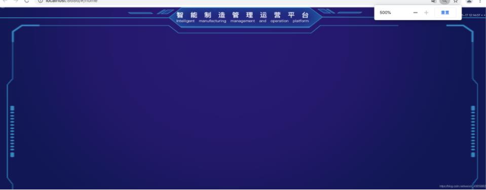
3.字体大小盒子宽度直接设置px不管放大缩小都是最初的样子,基本页面大小不会相差太远,下图是页面放大500倍的效果
以上就是本文的全部内容,希望对大家的学习有所帮助,也希望大家多多支持猪先飞。
原文出处:https://blog.csdn.net/weixin_43859882/article/details/119744
下一篇: js数组forEach实例用法详解
相关文章
- 这篇文章主要介绍了vue中activated的用法,帮助大家更好的理解和使用vue框架,感兴趣的朋友可以了解下...2021-01-03
基于vue-simple-uploader封装文件分片上传、秒传及断点续传的全局上传插件功能
这篇文章主要介绍了基于vue-simple-uploader封装文件分片上传、秒传及断点续传的全局上传插件,本文给大家介绍的非常详细,对大家的学习或工作具有一定的参考借鉴价值,需要的朋友可以参考下...2021-02-23Antd-vue Table组件添加Click事件,实现点击某行数据教程
这篇文章主要介绍了Antd-vue Table组件添加Click事件,实现点击某行数据教程,具有很好的参考价值,希望对大家有所帮助。一起跟随小编过来看看吧...2020-11-17- 这篇文章主要介绍了Vue基于localStorage存储信息代码实例,文中通过示例代码介绍的非常详细,对大家的学习或者工作具有一定的参考学习价值,需要的朋友可以参考下...2020-11-16
- 这篇文章主要介绍了vue 实现动态路由的方法,文中示例代码非常详细,帮助大家更好的理解和学习,感兴趣的朋友可以了解下...2020-07-06
- 这篇文章主要介绍了vue 监听 Treeselect 选择项的改变操作,具有很好的参考价值,希望对大家有所帮助。一起跟随小编过来看看吧...2020-09-01
- 这篇文章主要介绍了Vue组件跨层级获取组件操作,具有很好的参考价值,希望对大家有所帮助。一起跟随小编过来看看吧...2020-07-28
- 这篇文章主要介绍了vue 获取到数据但却渲染不到页面上的解决方法,文中通过示例代码介绍的非常详细,对大家的学习或者工作具有一定的参考学习价值,需要的朋友们下面随着小编来一起学习学习吧...2020-11-19
antdesign-vue结合sortablejs实现两个table相互拖拽排序功能
这篇文章主要介绍了antdesign-vue结合sortablejs实现两个table相互拖拽排序功能,本文通过实例图文相结合给大家介绍的非常详细,对大家的学习或工作具有一定的参考借鉴价值,需要的朋友可以参考下...2021-01-09vuejs element table 表格添加行,修改,单独删除行,批量删除行操作
这篇文章主要介绍了vuejs element table 表格添加行,修改,单独删除行,批量删除行操作,具有很好的参考价值,希望对大家有所帮助。一起跟随小编过来看看吧...2020-07-18- 这篇文章主要给大家介绍了关于Vue中slot-scope的深入理解,这个教程非常适合初学者,文中通过示例代码介绍的非常详细,对大家的学习或者工作具有一定的参考学习价值,需要的朋友们下面随着小编来一起学习学习吧...2021-04-17
- 最常见的多环境配置,就是开发环境配置,和生产环境配置,本文主要介绍了vue项目多环境配置的实现,感兴趣的可以了解一下...2021-07-20
- 这篇文章主要介绍了vue treeselect获取当前选中项的label实例,具有很好的参考价值,希望对大家有所帮助。一起跟随小编过来看看吧...2020-09-01
vue项目页面嵌入代码块vue-prism-editor的实现
这篇文章主要介绍了vue项目页面嵌入代码块vue-prism-editor的实现,本文给大家介绍的非常详细,对大家的学习或工作具有一定的参考借鉴价值,需要的朋友可以参考下...2020-10-30- 这篇文章主要介绍了Vue 3.0 中 jsx 语法使用,帮助大家更好的理解和使用vue框架,感兴趣的朋友可以了解下...2020-11-13
vue Treeselect下拉树只能选择第N级元素实现代码
这篇文章主要介绍了vue Treeselect下拉树只能选择第N级元素实现代码,具有很好的参考价值,希望对大家有所帮助。一起跟随小编过来看看吧...2020-09-01解决vue的router组件component在import时不能使用变量问题
这篇文章主要介绍了解决vue的router组件component在import时不能使用变量问题,具有很好的参考价值,希望对大家有所帮助。一起跟随小编过来看看吧...2020-07-27Ant design vue table 单击行选中 勾选checkbox教程
这篇文章主要介绍了Ant design vue table 单击行选中 勾选checkbox教程,具有很好的参考价值,希望对大家有所帮助。一起跟随小编过来看看吧...2020-10-25- 这篇文章主要为大家详细介绍了vue实现同时设置多个倒计时,文中示例代码介绍的非常详细,具有一定的参考价值,感兴趣的小伙伴们可以参考一下...2021-05-20
- 这篇文章主要介绍了WebStorm无法正确识别Vue3组合式API的解决方案,帮助大家更好的理解和学习使用vue框架,感兴趣的朋友可以了解下...2021-02-18