基于React封装组件的实现步骤
前言
很多小伙伴在第一次尝试封装组件时会和我一样碰到许多问题,比如人家的组件会有 color 属性,我们在使用组件时传入组件文档中说明的属性值如 primary ,那么这个组件的字体颜色会变为 primary 对应的颜色,这是如何做到的?还有别人封装的组件类名都有自己独特的前缀,这是如何处理的呢,难道是 css 类名全部加上前缀吗,这也太麻烦了!
如果你正在困惑这些问题,你可以看看这篇文章。
我会参照 antd的divider组件 来讲述如何基于React封装一个组件,以及解答上述的一些问题,请耐心看完!
antd 是如何封装组件的
仓库地址
- antd 仓库地址:https://github.com/ant-design/ant-design
- divider 组件在下图对应目录下 (代码我会拷贝过来,感兴趣的还是可以去克隆一下仓库)
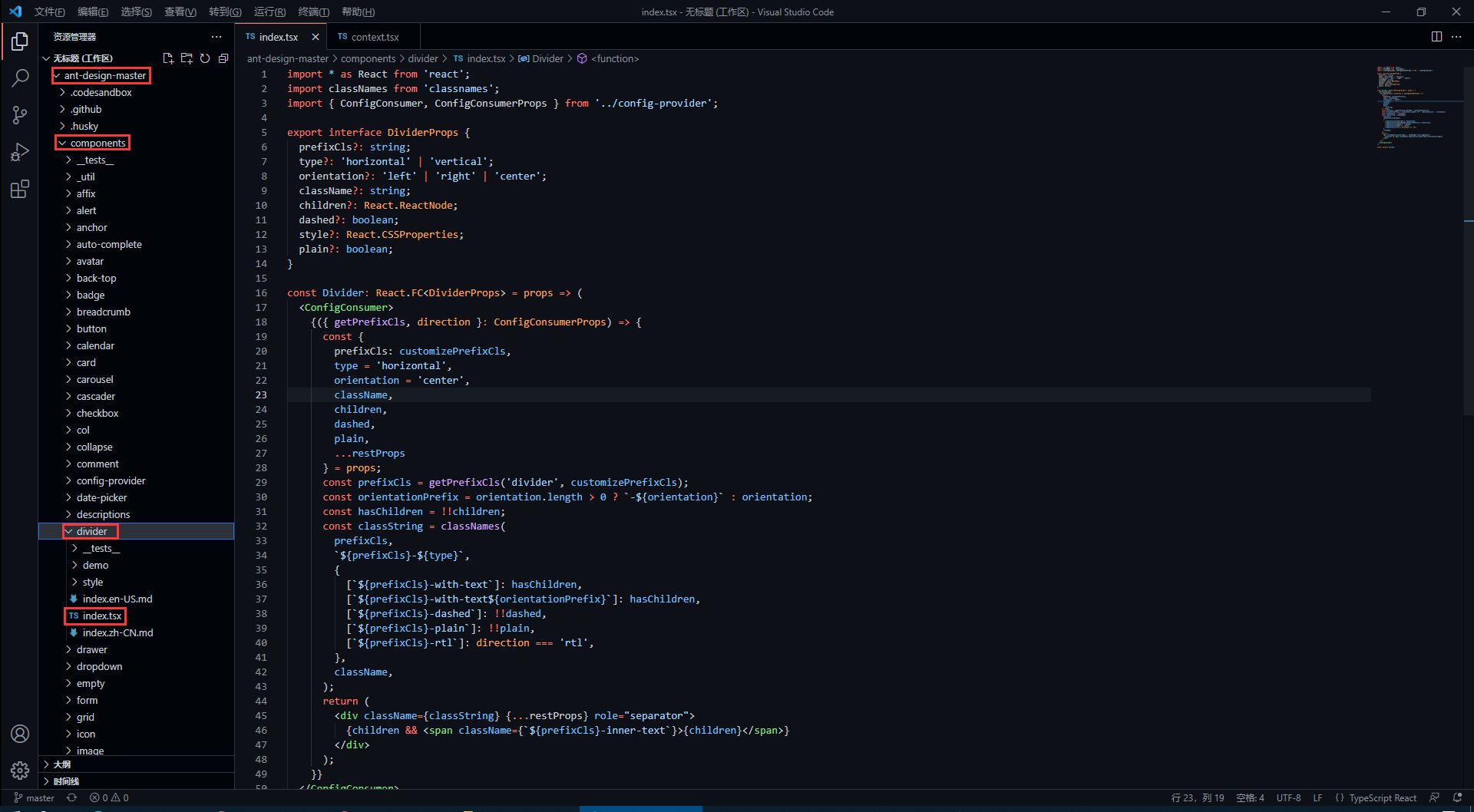
divider 组件源代码
antd 的源码使用了 TypeScript 语法,因此不了解语法的同学要及时了解哦!
import * as React from 'react';
import classNames from 'classnames';
import { ConfigConsumer, ConfigConsumerProps } from '../config-provider';

export interface DividerProps {
    prefixCls?: string;
    type?: 'horizontal' | 'vertical';
    orientation?: 'left' | 'right' | 'center';
    className?: string;
    children?: React.ReactNode;
    dashed?: boolean;
    style?: React.CSSProperties;
    plain?: boolean;
}

const Divider: React.FC<DividerProps> = props => (
    <ConfigConsumer>
        {({ getPrefixCls, direction }: ConfigConsumerProps) => {
            const {
                prefixCls: customizePrefixCls,
                type = 'horizontal',
                orientation = 'center',
                className,
                children,
                dashed,
                plain,
                ...restProps
            } = props;
            const prefixCls = getPrefixCls('divider', customizePrefixCls);
            const orientationPrefix = orientation.length > 0 ? `-${orientation}` : orientation;
            const hasChildren = !!children;
            const classString = classNames(
                prefixCls,
                `${prefixCls}-${type}`,
                {
                    [`${prefixCls}-with-text`]: hasChildren,
                    [`${prefixCls}-with-text${orientationPrefix}`]: hasChildren,
                    [`${prefixCls}-dashed`]: !!dashed,
                    [`${prefixCls}-plain`]: !!plain,
                    [`${prefixCls}-rtl`]: direction === 'rtl',
                },
                className,
            );
            return (
                <div className={classString} {...restProps} role="separator">
                    {children && <span className={`${prefixCls}-inner-text`}>{children}</span>}
                </div>
            );
        }}
    </ConfigConsumer>
);

export default Divider;
如何暴露组件属性
在源码中,最先看到的是以下内容,这些属性也就是divider组件所暴露的属性,我们可以 <Divider type='vertical' /> 这样来传入 type 属性,那么 divider 分割线样式就会渲染为垂直分割线,是不是很熟悉!
export interface DividerProps { // interface 是 TypeScript 的语法
    prefixCls?: string;
    type?: 'horizontal' | 'vertical'; // 限定 type 只能传入两个值中的一个
    orientation?: 'left' | 'right' | 'center';
    className?: string;
    children?: React.ReactNode;
    dashed?: boolean;
    style?: React.CSSProperties;
    plain?: boolean;
}
在上面的属性中,我们还发现 className 和 style是比较常见的属性,这代表我们可以 <Divider type='vertical' className='myClassName' style={{width: '1em'}} /> 这样使用这些属性。
如何设置统一类名前缀
我们知道,antd 的组件类名会有他们独特的前缀 ant-,这是如何处理的呢?继续看源码。
<ConfigConsumer>
    {({ getPrefixCls, direction }: ConfigConsumerProps) => {
        const {
            prefixCls: customizePrefixCls,
            type = 'horizontal',
            orientation = 'center',
            className,
            children,
            dashed,
            plain,
            ...restProps
        } = props;
        const prefixCls = getPrefixCls('divider', customizePrefixCls);
从源码中,我们发现 prefixCls ,这里是通过 getPrefixCls 方法生成,再看看 getPrefixCls 方法的源码,如下。
export interface ConfigConsumerProps {
  ...
  getPrefixCls: (suffixCls?: string, customizePrefixCls?: string) => string;
  ...
}

const defaultGetPrefixCls = (suffixCls?: string, customizePrefixCls?: string) => {
  if (customizePrefixCls) return customizePrefixCls;

  return suffixCls ? `ant-${suffixCls}` : 'ant';
};
不难发现此时会生成的类名前缀为 ant-divider 。
如何处理样式与类名
我们封装的组件肯定是有预设的样式,又因为样式要通过类名来定义,而我们传入的属性值则会决定组件上要添加哪个类名,这又是如何实现的呢?下面看源码。
import classNames from 'classnames';

const classString = classNames(
    prefixCls,
    `${prefixCls}-${type}`,
    {
        [`${prefixCls}-with-text`]: hasChildren,
        [`${prefixCls}-with-text${orientationPrefix}`]: hasChildren,
        [`${prefixCls}-dashed`]: !!dashed,
        [`${prefixCls}-plain`]: !!plain,
        [`${prefixCls}-rtl`]: direction === 'rtl',
    },
    className,
);
return (
    <div className={classString} {...restProps} role="separator">
        {children && <span className={`${prefixCls}-inner-text`}>{children}</span>}
    </div>
);
我们发现,它通过 classNames 方法(classNames是React处理多类名的组件)定义了一个所有类名的常量,然后传给了 div 中的 className 属性。
其实生成的类名也就是 ant-divider-horizontal 这个样子,那么css中以此类名定义的样式也就自然会生效了。而 className 和 style 属性则是通过 {...restProps} 来传入。
最后我们再看看它的css样式代码是怎么写的!
divider 组件样式源代码
antd 组件的样式使用 Less 书写,不了解 Less 语法的同学一定要了解一下。
@import '../../style/themes/index';
@import '../../style/mixins/index';

@divider-prefix-cls: ~'@{ant-prefix}-divider'; // 可以看到这里对应的也就是之前说到的类名前缀

.@{divider-prefix-cls} {
  .reset-component();

  border-top: @border-width-base solid @divider-color;

  &-vertical { // 这里的完整类名其实就是 ant-divider-vertical, 也就是 divider 组件的 type 属性值为 vertical 时对应的样式
    position: relative;
    top: -0.06em;
    display: inline-block;
    height: 0.9em;
    margin: 0 8px;
    vertical-align: middle;
    border-top: 0;
    border-left: @border-width-base solid @divider-color;
  }

  &-horizontal {
    display: flex;
    clear: both;
    width: 100%;
    min-width: 100%;
    margin: 24px 0;
  }

  &-horizontal&-with-text {
    display: flex;
    margin: 16px 0;
    color: @heading-color;
    font-weight: 500;
    font-size: @font-size-lg;
    white-space: nowrap;
    text-align: center;
    border-top: 0;
    border-top-color: @divider-color;

    &::before,
    &::after {
      position: relative;
      top: 50%;
      width: 50%;
      border-top: @border-width-base solid transparent;
      // Chrome not accept `inherit` in `border-top`
      border-top-color: inherit;
      border-bottom: 0;
      transform: translateY(50%);
      content: '';
    }
  }

  &-horizontal&-with-text-left {
    &::before {
      top: 50%;
      width: @divider-orientation-margin;
    }

    &::after {
      top: 50%;
      width: 100% - @divider-orientation-margin;
    }
  }

  &-horizontal&-with-text-right {
    &::before {
      top: 50%;
      width: 100% - @divider-orientation-margin;
    }

    &::after {
      top: 50%;
      width: @divider-orientation-margin;
    }
  }

  &-inner-text {
    display: inline-block;
    padding: 0 @divider-text-padding;
  }

  &-dashed {
    background: none;
    border-color: @divider-color;
    border-style: dashed;
    border-width: @border-width-base 0 0;
  }

  &-horizontal&-with-text&-dashed {
    border-top: 0;

    &::before,
    &::after {
      border-style: dashed none none;
    }
  }

  &-vertical&-dashed {
    border-width: 0 0 0 @border-width-base;
  }

  &-plain&-with-text {
    color: @text-color;
    font-weight: normal;
    font-size: @font-size-base;
  }
}

@import './rtl';
这样一来,我相信同学们也大概了解如何去封装一个组件以及关键点了,在源码中还有很多地方值得我们学习,比如这里的 ConfigConsumer 的定义与使用,感兴趣的同学欢迎一起交流。
到此这篇关于基于React封装组件的实现步骤的文章就介绍到这了,更多相关React 封装组件内容请搜索猪先飞以前的文章或继续浏览下面的相关文章希望大家以后多多支持猪先飞!
原文出处:https://www.cnblogs.com/guying-blog/p/15612611.html
相关文章
基于vue-simple-uploader封装文件分片上传、秒传及断点续传的全局上传插件功能
这篇文章主要介绍了基于vue-simple-uploader封装文件分片上传、秒传及断点续传的全局上传插件,本文给大家介绍的非常详细,对大家的学习或工作具有一定的参考借鉴价值,需要的朋友可以参考下...2021-02-23- 这篇文章主要介绍了Vue组件跨层级获取组件操作,具有很好的参考价值,希望对大家有所帮助。一起跟随小编过来看看吧...2020-07-28
关于React Native报Cannot initialize a parameter of type'NSArray<id<RCTBridgeModule>>错误(解决方案)
这篇文章主要介绍了关于React Native报Cannot initialize a parameter of type'NSArray<id<RCTBridgeModule>>错误,本文给大家分享解决方案,需要的朋友可以参考下...2021-05-12- 今天我们来给大家介绍下在Vue开发中我们经常会碰到的一种需求场景,本文主要介绍了Vue动态查询规则生成组件,需要的朋友们下面随着小编来一起学习学习吧...2021-05-27
- 这篇文章主要介绍了js组件SlotMachine实现图片切换效果制作抽奖系统的相关资料,需要的朋友可以参考下...2016-04-19
React引入antd-mobile+postcss搭建移动端
本文给大家分享React引入antd-mobile+postcss搭建移动端的详细流程,文末给大家分享我的一些经验记录使用antd-mobile时发现我之前配置的postcss失效了,防止大家踩坑,特此把解决方案分享到脚本之家平台,需要的朋友参考下吧...2021-06-21- 这篇文章主要介绍了React使用高德地图的实现示例(react-amap),文中通过示例代码介绍的非常详细,对大家的学习或者工作具有一定的参考学习价值,需要的朋友们下面随着小编来一起学习学习吧...2021-04-18
- 这篇文章主要介绍了vue中如何使用element的日历组件,本文通过实例代码给大家介绍的非常详细,对大家的学习或工作具有一定的参考借鉴价值,需要的朋友可以参考下...2021-09-30
使用 React 和 Threejs 创建一个VR全景项目的过程详解
这篇文章主要介绍了使用 React 和 Threejs 创建一个VR全景项目的过程详解,本文通过实例代码给大家介绍的非常详细,对大家的学习或工作具有一定的参考借鉴价值,需要的朋友可以参考下...2021-04-06- 这篇文章主要介绍了Vue多选列表组件深入详解,这个是vue的基本组件,有需要的同学可以研究下...2021-03-03
- 在本篇内容里小编给大家分享的是关于c#使用封装方法以及相关知识点,对此有需要的朋友们可以学习下。...2020-06-25
- 思路其实没有那么复杂,把地图想成一个盒子容器,地图中心点想成盒子中心点;扎点在【地图中心点】不会动,当移动地图时,去获取【地图中心点】经纬度,设置某个位置的时候,将经纬度设置为【地图中心点】即可...2021-06-20
- 在网页中,经常见到进度条效果,那么这些个性的进度条组件效果是怎么实现的呢,下面脚本之家小编给大家分享Bootstrap进度条组件知识详解,感兴趣的朋友要求学习吧...2016-05-04
- 这篇文章主要介绍了vue+element-ui表格封装tag标签使用插槽,文中通过示例代码介绍的非常详细,对大家的学习或者工作具有一定的参考学习价值,需要的朋友们下面随着小编来一起学习学习吧...2020-06-19
- 这篇文章主要为大家详细介绍了React列表栏及购物车组件使用,文中示例代码介绍的非常详细,具有一定的参考价值,感兴趣的小伙伴们可以参考一下...2021-06-28
- 这篇文章主要介绍了react使用antd表单赋值,用于修改弹框的操作,具有很好的参考价值,希望对大家有所帮助。一起跟随小编过来看看吧...2020-10-29
- 这篇文章主要介绍了Vue父子组件传值的一些坑,帮助大家更好的理解和使用vue父子组件,感兴趣的朋友可以了解下...2020-09-16
- 这篇文章主要为大家详细介绍了vue递归实现自定义tree组件,文中示例代码介绍的非常详细,具有一定的参考价值,感兴趣的小伙伴们可以参考一下...2021-08-20
- 这篇文章主要介绍了React Native 启动流程简析,文以 react-native-cli 创建的示例工程(安卓部分)为例,给大家分析 React Native 的启动流程,需要的朋友可以参考下...2021-08-18
- 这篇文章主要介绍了封装 axios+promise通用请求函数操作,具有很好的参考价值,希望对大家有所帮助。一起跟随小编过来看看吧...2020-08-12