vue商城中商品“筛选器”功能的实现代码
vue商城中商品“筛选器”功能的实现
在使用vue搭建商城项目的时候,要实现一个商品筛选器的功能,在完成之后,再一次被vue的数据驱动的强大感到震撼!
首先,我们来看一下具体的需求吧。你可以先看下面的这两张图,然后再看文字描述,可能会更容易理解。
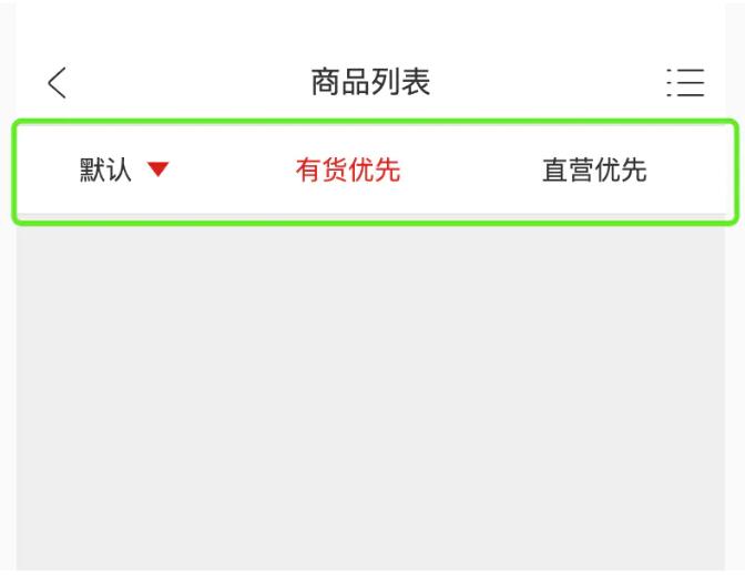
没有触发时的状态
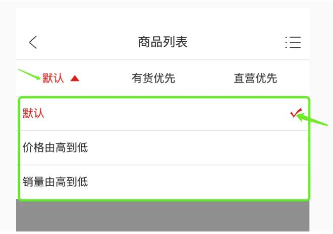
触发后的状态
我们需求有下面几点:
1、默认情况下,只显示一级菜单,二级菜单不显
2、存在二级菜单的情况下,在二级菜单没有显示的情况下,点击一级菜单,一级菜单的样式发生改变,二级菜单不显示
3、存在二级菜单的情况下,一级菜单已经点击过之后,再点击一级菜单,会显示二级菜单
我们举例子说明一下,当前的一级菜单有默认、有货优先、直营优先,只有默认是含有二级菜单的,比如现在焦点在有货优先上面,那么我们点击默认的时候,不会弹出默认下面的二级菜单,只会改变一级菜单默认的样式(字体和三角形的颜色),当再次点击一级菜单默认的时候,其下面的二级菜单就显示出来了。
需求分析完成后,我们开始编写代码吧。
一、创建筛选器数据结构
跟以前的开发方式不同,我们首先要创建数据结构,而不是编写模版代码。
1、设置筛选器数据结构
// 数据源
optionsDatas: [
  {
   id: '1',
   name: '默认',
   subs: [
    {
     id: '1',
     name: '默认',
    },
    {
      id: '1-2',
      name: '价格由高到低',
    },
    {
      id: '1-3',
      name: '销量由高到低',
    },
    ]
  },
  {
   id: '2',
   name: '有货优先',
   subs: []
  },
  {
   id: '3',
   name: '直营优先',
   subs: []
  }
]
这个数据结构设计得是非常出彩的,此处您可能还看不到,在下面具体的应用中你就能感觉到它的优美呢。
2、设置二级菜单(选中项subs)的数据结构
// 选中的筛选项
selectOption: {},
// 是否展开子筛选项
sShowSubContent: false
  当然,我们要在created钩子函数中对selecOption进行赋值操作,保证其具有初始值。

created: function () {
  // 设置初始选中项
  this.selectOption = this.optionsDatas[0];
}
二、设置模版代码
下面是完整模版代码,内容相对比较多,我们按照功能逐块进行讲解吧。
<div class="goods-options z-index-2">
  <ul class="goods-options-list">
   <li class="goods-options-item" v-for="(item, index) in optionsDatas" :key="index">
    <a class="goods-options-item-content" @click="onOptionsItemClick(item, index)">
     <span class="goods-options-item-content-name" :class="{'goods-options-item-content-name-active' : selectOption.id === item.id}">{{item.name}}</span>
     <span class="goods-options-item-content-caret caret" v-if="item.subs.length > 0"
     :class="[isShowSubContent && selectOption.id === item.id ? 'goods-options-item-content-caret-open' : 'goods-options-item-content-caret-close']"
     ></span>
    </a>
   </li>
  </ul>
  <transition name="fold-height">
   <div class="options-sub-content z-index-2" v-show="isShowSubContent">
    <ul class="options-sub-content-list">
     <li class="options-sub-content-list-item" v-for="(item, index) in selectOption.subs" :key="index" @click="onSubOptionsItemClick(item, index)">
      <a class="options-sub-content-list-item-content">
       <span class="options-sub-content-list-item-content-name" :class="{'options-sub-content-list-item-content-name-active' : selectOption.id === item.id}">{{item.name}}</span>
       <img class="options-sub-content-list-item-content-select" v-show="selectOption.id === item.id" src="@img/options-select.svg" alt="" srcset="">
      </a>
     </li>
    </ul>
   </div>
  </transition>

  <div class="cover" v-show="isShowSubContent" @click="isShowSubContent = false"></div>
</div>
1、渲染一级菜单
  <ul class="goods-options-list">
   <li class="goods-options-item" v-for="(item, index) in optionsDatas" :key="index">
    <a class="goods-options-item-content" @click="onOptionsItemClick(item, index)">
     <span class="goods-options-item-content-name" :class="{'goods-options-item-content-name-active' : selectOption.id === item.id}">{{item.name}}</span>
     <span class="goods-options-item-content-caret caret" v-if="item.subs.length > 0"
     :class="[isShowSubContent && selectOption.id === item.id ? 'goods-options-item-content-caret-open' : 'goods-options-item-content-caret-close']"
     ></span>
    </a>
   </li>
  </ul>
1.1、一级菜单的样式变化
一级菜单的文字颜色的变化需要满足下面的规则,也就是selectOption.id === item.id。也就是说在当选中是一级菜单是默认的时候,我们就要其文字颜色改编成红色。
:class="{'goods-options-item-content-name-active' : selectOption.id === item.id}"
相应地,三角形的颜色和箭头的朝向也需要进行更改。更改的逻辑如下。当然,如果一级菜单没有对应的二级菜单时,三角形就不应该显示。
:class="[isShowSubContent && selectOption.id === item.id ? 'goods-options-item-content-caret-open' : 'goods-options-item-content-caret-close']"
v-if="item.subs.length > 0"
1.2、一级菜单的点击事件onOptionsItemClick(item, index)实现的主要功能是改变一次菜单的样式和二级菜单的显示/隐藏。具体的功能如下分析所示:
1、如果子选项视图处于展开状态,则关闭掉子选项视图
2、展示子选项视图
2.1、选中项包含子选项
2.2、当前筛选项处于选中状态
3、设置选中项为用户点击的选项
onOptionsItemClick: function (item, index) {
  // 如果子选项视图处于展开状态,则关闭掉子选项视图
  if (this.isShowSubContent) {
   this.isShowSubContent = false;
   return;
  }
  // 1、选中项包含子选项
  // 2、当前筛选项处于选中状态
  // 展示子选项视图
  if (item.subs.length > 0 && this.selectOption.id === item.id) {
   this.isShowSubContent = true;
  }
   // 设置选中项为用户点击的选项
  this.selectOption = item;
}
2、渲染二级菜单
<transition name="fold-height">
 <div class="options-sub-content z-index-2" v-show="isShowSubContent">
   <ul class="options-sub-content-list">
    <li class="options-sub-content-list-item" v-for="(item, index) in selectOption.subs" :key="index" @click="onSubOptionsItemClick(item, index)">
     <a class="options-sub-content-list-item-content">
      <span class="options-sub-content-list-item-content-name" :class="{'options-sub-content-list-item-content-name-active' : selectOption.id === item.id}">{{item.name}}</span>
      <img class="options-sub-content-list-item-content-select" v-show="selectOption.id === item.id" src="@img/options-select.svg" alt="" srcset="">
     </a>
    </li>
   </ul>
  </div>
</transition>
2.1、二级菜单样式的变化
二级菜单的样式变化需要满足下面的规则。这个规则基本上跟一级菜单的一致。
:class="{'options-sub-content-list-item-content-name-active' : selectOption.id === item.id}"
对于右侧的对勾,需要符合下面的逻辑。
v-show="selectOption.id === item.id"
2.2、二级菜单的点击事件onSubOptionsItemClick(item, index),这个事件需要实现功能如下:
1、设置选中项为用户点击的选项
2、将选中项置顶
3、关闭子选项视图
onSubOptionsItemClick: function (subItem, index) {
  // 遍历所有的可选项,将选中项置顶
  this.optionsDatas.forEach(options => {
   options.subs.forEach (subOptions => {
    if (subOptions.id === subItem.id) {
     options.id = subOptions.id;
     options.name = subOptions.name;
     }
   })
  });
  // 关闭子选项视图
  this.isShowSubContent = false;
}
2.3、二级菜单动画的实现
二级菜单动画的实现,我们采用了vue的过度动画。其使用到的css动画如下:
/**
 子选项内容区展开动画,当 v-if=“true” 的时候调用
 当子选项部分展开时,初始状态max-height为0,结束状态max-height为180
*/
 .fold-height-enter-active {
  animation-duration: .3s;
  animation-name: fold-height-open;
 }

 @keyframes fold-height-open {
   0% {
    max-height: 0;
   }
   100% {
    max-height: px2rem(180);
   }
 }
/**
 子选项内容区关闭动画,当 v-if=false 的时候调用
 当子选项部分关闭时,初始状态max-height为180,结束状态max-height为0
*/
  .fold-height-leave-active {
   animation-duration: .3s;
   animation-name: fold-height-close;
  }

  @keyframes fold-height-close {
   0% {
    max-height: px2rem(180);
   }
   100% {
    max-height: 0;
   }
  }
2、遮罩的显示/隐藏
最后就剩下一个遮罩的样式和逻辑了,这个比较简单,其逻辑如下:此处不在进行多余的解释。
<div class="cover" v-show="isShowSubContent" @click="isShowSubContent = false">
</div>
至此,我们所有的逻辑分析和代码实现都已完成。设计的最巧妙的就是这个数据结构,完全满足了我们业务需求。在下面是完整的代码,希望对您有用。
<template>
 <div class="goods-options z-index-2">
  <ul class="goods-options-list">
   <li class="goods-options-item" v-for="(item, index) in optionsDatas" :key="index">
    <a class="goods-options-item-content" @click="onOptionsItemClick(item, index)">
     <span class="goods-options-item-content-name" :class="{'goods-options-item-content-name-active' : selectOption.id === item.id}">{{item.name}}</span>
     <span class="goods-options-item-content-caret caret" v-if="item.subs.length > 0"
     :class="[isShowSubContent && selectOption.id === item.id ? 'goods-options-item-content-caret-open' : 'goods-options-item-content-caret-close']"
     ></span>
    </a>
   </li>
  </ul>
  <transition name="fold-height">
   <div class="options-sub-content z-index-2" v-show="isShowSubContent">
    <ul class="options-sub-content-list">
     <li class="options-sub-content-list-item" v-for="(item, index) in selectOption.subs" :key="index" @click="onSubOptionsItemClick(item, index)">
      <a class="options-sub-content-list-item-content">
       <span class="options-sub-content-list-item-content-name" :class="{'options-sub-content-list-item-content-name-active' : selectOption.id === item.id}">{{item.name}}</span>
       <img class="options-sub-content-list-item-content-select" v-show="selectOption.id === item.id" src="@img/options-select.svg" alt="" srcset="">
      </a>
     </li>
    </ul>
   </div>
  </transition>

  <div class="cover" v-show="isShowSubContent" @click="isShowSubContent = false"></div>
 </div>
</template>


<script>
export default {
 data: function () {
  return {
   // 数据源
   optionsDatas: [
    {
     id: '1',
     name: '默认',
     subs: [
      {
       id: '1',
       name: '默认',
      },
      {
       id: '1-2',
       name: '价格由高到低',
      },
      {
       id: '1-3',
       name: '销量由高到低',
      },
     ]
    },
    {
     id: '2',
     name: '有货优先',
     subs: []
    },{
     id: '3',
     name: '直营优先',
     subs: []
    }
   ],
   // 选中的筛选项
   selectOption: {},
   // 是否展开子筛选项
   isShowSubContent: false
  }
 },
 created: function () {
  // 设置初始选中项
  this.selectOption = this.optionsDatas[0];
 },
 methods: {
  /**
   * 1、如果子选项视图处于展开状态,则关闭掉子选项视图
   * 2、展示子选项视图
   *  1、选中项包含子选项
   *  2、当前筛选项处于选中状态
   * 3、设置选中项为用户点击的选项
   */
  onOptionsItemClick: function (item, index) {
   // 如果子选项视图处于展开状态,则关闭掉子选项视图
   if (this.isShowSubContent) {
    this.isShowSubContent = false;
    return;
   }
   // 1、选中项包含子选项
   // 2、当前筛选项处于选中状态
   // 展示子选项视图
   if (item.subs.length > 0 && this.selectOption.id === item.id) {
    this.isShowSubContent = true;
   }
   // 设置选中项为用户点击的选项
   this.selectOption = item;


  },
  /**
   * 1、设置选中项为用户点击的选项
   * 2、将选中项置顶
   * 3、关闭子选项视图
   */
  onSubOptionsItemClick: function (subItem, index) {
   // 设置选中项为用户点击的选项
   // this.selectOption = subItem;

   // 遍历所有的可选项,将选中项置顶
   this.optionsDatas.forEach(options => {
    options.subs.forEach (subOptions => {
     if (subOptions.id === subItem.id) {
      options.id = subOptions.id;
      options.name = subOptions.name;
     }
    })
   });

   // 关闭子选项视图
   this.isShowSubContent = false;
  },

 },
 watch: {
  /**
   * 当选择项发生变化的时候,需要通知父组件
   */
  selectOption: function (newValue, oldValue) {
   this.$emit('optionsChange', newValue);
  }
 }
}
</script>


<style lang="scss" scoped>
@import '@css/style.scss';
 .goods-options {
  width: 100%;
  border-bottom: 1px solid $lineColor;
  &-list {
   display: flex;
   width: 100%;
   height: $goodsOptionsHeight;
   background-color: white;
   .goods-options-item {
    flex-grow: 1;

    &-content {
     height: 100%;
     display: flex;
     justify-content: center;
     align-items: center;

     &-name {
      font-size: $infoSize;
      margin-right: $marginSize;

      &-active{
       color: $mainColor;
      }
     }

     // 子选项展开时,三角形的动画
     &-caret {
      &-open {
       transform:rotate(-180deg);
       transition: all .3s;
      }

      &-close {
       transform:rotate(0deg);
       transition: all .3s;
      }
     }

    }
   }

  }

  // 子选项内容区
  .options-sub-content {
   // 脱离标准文档流
   position: absolute;
   width: 100%;
   max-height: px2rem(180);
   overflow: hidden;
   overflow-y: auto;
   background-color: white;
   &-list {

    &-item {

     &-content {
      display: flex;
      align-items: center;
      border-top: 1px solid $lineColor;
      padding: $marginSize;
      height: px2rem(44);
      box-sizing: border-box;
      &-name {
       font-size: $infoSize;
       display: inline-block;
       flex-grow: 1;

       &-active{
        color: $mainColor;
       }
      }

      &-select {
       width: px2rem(18);
       height: px2rem(18);
      }

     }

    }
   }
  }

  /**
   子选项内容区展开动画,当 v-if=“true” 的时候调用
   当子选项部分展开时,初始状态max-height为0,结束状态max-height为180
  */
  .fold-height-enter-active {
   animation-duration: .3s;
   animation-name: fold-height-open;
  }

  @keyframes fold-height-open {
   0% {
    max-height: 0;
   }
   100% {
    max-height: px2rem(180);
   }
  }

  /**
   子选项内容区关闭动画,当 v-if=false 的时候调用
   当子选项部分关闭时,初始状态max-height为180,结束状态max-height为0
  */
  .fold-height-leave-active {
   animation-duration: .3s;
   animation-name: fold-height-close;
  }

  @keyframes fold-height-close {
   0% {
    max-height: px2rem(180);
   }
   100% {
    max-height: 0;
   }
  }
 }
</style>
总结
到此这篇关于vue商城中商品“筛选器”功能的实现代码的文章就介绍到这了,更多相关vue商品筛选器内容请搜索猪先飞以前的文章或继续浏览下面的相关文章希望大家以后多多支持猪先飞!
相关文章
- 这篇文章主要介绍了vue中activated的用法,帮助大家更好的理解和使用vue框架,感兴趣的朋友可以了解下...2021-01-03
基于vue-simple-uploader封装文件分片上传、秒传及断点续传的全局上传插件功能
这篇文章主要介绍了基于vue-simple-uploader封装文件分片上传、秒传及断点续传的全局上传插件,本文给大家介绍的非常详细,对大家的学习或工作具有一定的参考借鉴价值,需要的朋友可以参考下...2021-02-23Antd-vue Table组件添加Click事件,实现点击某行数据教程
这篇文章主要介绍了Antd-vue Table组件添加Click事件,实现点击某行数据教程,具有很好的参考价值,希望对大家有所帮助。一起跟随小编过来看看吧...2020-11-17- 这篇文章主要介绍了vue 实现动态路由的方法,文中示例代码非常详细,帮助大家更好的理解和学习,感兴趣的朋友可以了解下...2020-07-06
- 这篇文章主要介绍了Vue组件跨层级获取组件操作,具有很好的参考价值,希望对大家有所帮助。一起跟随小编过来看看吧...2020-07-28
- 这篇文章主要介绍了Vue基于localStorage存储信息代码实例,文中通过示例代码介绍的非常详细,对大家的学习或者工作具有一定的参考学习价值,需要的朋友可以参考下...2020-11-16
- 这篇文章主要介绍了vue 获取到数据但却渲染不到页面上的解决方法,文中通过示例代码介绍的非常详细,对大家的学习或者工作具有一定的参考学习价值,需要的朋友们下面随着小编来一起学习学习吧...2020-11-19
antdesign-vue结合sortablejs实现两个table相互拖拽排序功能
这篇文章主要介绍了antdesign-vue结合sortablejs实现两个table相互拖拽排序功能,本文通过实例图文相结合给大家介绍的非常详细,对大家的学习或工作具有一定的参考借鉴价值,需要的朋友可以参考下...2021-01-09- 这篇文章主要介绍了vue 监听 Treeselect 选择项的改变操作,具有很好的参考价值,希望对大家有所帮助。一起跟随小编过来看看吧...2020-09-01
- 最常见的多环境配置,就是开发环境配置,和生产环境配置,本文主要介绍了vue项目多环境配置的实现,感兴趣的可以了解一下...2021-07-20
- 这篇文章主要介绍了Vue 3.0 中 jsx 语法使用,帮助大家更好的理解和使用vue框架,感兴趣的朋友可以了解下...2020-11-13
vue项目页面嵌入代码块vue-prism-editor的实现
这篇文章主要介绍了vue项目页面嵌入代码块vue-prism-editor的实现,本文给大家介绍的非常详细,对大家的学习或工作具有一定的参考借鉴价值,需要的朋友可以参考下...2020-10-30解决vue的router组件component在import时不能使用变量问题
这篇文章主要介绍了解决vue的router组件component在import时不能使用变量问题,具有很好的参考价值,希望对大家有所帮助。一起跟随小编过来看看吧...2020-07-27vue Treeselect下拉树只能选择第N级元素实现代码
这篇文章主要介绍了vue Treeselect下拉树只能选择第N级元素实现代码,具有很好的参考价值,希望对大家有所帮助。一起跟随小编过来看看吧...2020-09-01- 这篇文章主要为大家详细介绍了vue实现同时设置多个倒计时,文中示例代码介绍的非常详细,具有一定的参考价值,感兴趣的小伙伴们可以参考一下...2021-05-20
Ant design vue table 单击行选中 勾选checkbox教程
这篇文章主要介绍了Ant design vue table 单击行选中 勾选checkbox教程,具有很好的参考价值,希望对大家有所帮助。一起跟随小编过来看看吧...2020-10-25- 这篇文章主要介绍了Vue select 绑定动态变量的实例讲解,具有很好的参考价值,希望对大家有所帮助。一起跟随小编过来看看吧...2020-10-23
- 这篇文章主要为大家详细介绍了vue实现div单选多选功能,文中示例代码介绍的非常详细,具有一定的参考价值,感兴趣的小伙伴们可以参考一下...2020-07-16
vuejs element table 表格添加行,修改,单独删除行,批量删除行操作
这篇文章主要介绍了vuejs element table 表格添加行,修改,单独删除行,批量删除行操作,具有很好的参考价值,希望对大家有所帮助。一起跟随小编过来看看吧...2020-07-18- 这篇文章主要介绍了vue treeselect获取当前选中项的label实例,具有很好的参考价值,希望对大家有所帮助。一起跟随小编过来看看吧...2020-09-01