Flutter Widgets之标签类控件Chip详解
概述:
Flutter 标签类控件大全ChipFlutter内置了多个标签类控件,但本质上它们都是同一个控件,只不过是属性参数不同而已,在学习的过程中可以将其放在放在一起学习,方便记忆。
RawChip
Material风格标签控件,此控件是其他标签控件的基类,通常情况下,不会直接创建此控件,而是使用如下控件:
- Chip
- InputChip
- ChoiceChip
- FilterChip
- ActionChip
如果你想自定义标签类控件,通常使用此控件。
RawChip可以通过设置onSelected被选中,设置onDeleted被删除,也可以通过设置onPressed而像一个按钮,它有一个label属性,有一个前置(avatar)和后置图标(deleteIcon)。
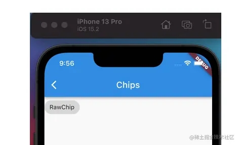
RawChip(label: Text('RawChip')),
效果:
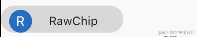
设置左侧控件,一般是图标:
 RawChip(
            avatar: CircleAvatar(child: Text('R'),),
            label: Text('RawChip'),
            isEnabled: false,//禁止点选状态
          ),

设置label的样式和内边距:
 RawChip(
            avatar: CircleAvatar(child: Text('R'),),
            label: Text('RawChip'),
            // isEnabled: false,//禁止点选状态
            labelPadding: EdgeInsets.symmetric(horizontal: 20),
            padding: EdgeInsets.only(left: 10,right: 10,top: 5),
          ),
设置删除相关属性:
  RawChip(
            label: Text('RawChip'),
            onDeleted: (){
              print('onDeleted');
            },
            deleteIcon: Icon(Icons.delete),
            deleteIconColor: Colors.red,
            deleteButtonTooltipMessage: "删除",
            // isEnabled: false,//禁止点选状态
            labelPadding: EdgeInsets.symmetric(horizontal: 10),
            padding: EdgeInsets.only(left: 10,right: 10,top: 5,bottom: 5),
          ),

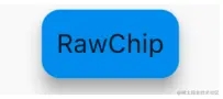
设置形状、背景颜色及内边距,阴影:
 RawChip(
            label: Text('RawChip'),
            shape: RoundedRectangleBorder(borderRadius: BorderRadius.circular(10)),
            backgroundColor: Colors.blue,
            padding: EdgeInsets.symmetric(vertical: 10),
            elevation: 8,
            shadowColor: Colors.grey,
          )
materialTapTargetSize是配置组件点击区域大小的属性,很多组件都有此属性,比如:
[FloatingActionButton], only the mini tap target size is increased.
* [MaterialButton]
* [OutlineButton]
* [FlatButton]
* [RaisedButton]
* [TimePicker]
* [SnackBar]
* [Chip]
* [RawChip]
* [InputChip]
* [ChoiceChip]
* [FilterChip]
* [ActionChip]
* [Radio]
* [Switch]
* [Checkbox]
MaterialTapTargetSize有2个值,分别为:
- padded:最小点击区域为48*48。
- shrinkWrap:子组件的实际大小。
设置选中状态、颜色:
 RawChip(
              label: Text('RawChip'),
               selected: _selected,
            onSelected: (v){
                setState(() {
                  _selected =v;
                });
            },
            selectedColor: Colors.blue,
            selectedShadowColor: Colors.red,
          )

Chip
Chip是一个简单的标签控件,仅显示信息和删除相关属性,是一个简化版的RawChip,用法和RawChip一样。源代码如下:
@override
Widget build(BuildContext context) {
  assert(debugCheckHasMaterial(context));
  return RawChip(
    avatar: avatar,
    label: label,
    labelStyle: labelStyle,
    labelPadding: labelPadding,
    deleteIcon: deleteIcon,
    onDeleted: onDeleted,
    deleteIconColor: deleteIconColor,
    deleteButtonTooltipMessage: deleteButtonTooltipMessage,
    tapEnabled: false,
    shape: shape,
    clipBehavior: clipBehavior,
    focusNode: focusNode,
    autofocus: autofocus,
    backgroundColor: backgroundColor,
    padding: padding,
    materialTapTargetSize: materialTapTargetSize,
    elevation: elevation,
    shadowColor: shadowColor,
    isEnabled: true,
  );
}
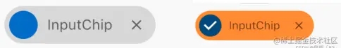
InputChip
以紧凑的形式表示一条复杂的信息,例如实体(人,地方或事物)或对话文本。
InputChip 本质上也是RawChip,用法和RawChip一样。源代码如下:
override
Widget build(BuildContext context) {
  assert(debugCheckHasMaterial(context));
  return RawChip(
    avatar: avatar,
    label: label,
    labelStyle: labelStyle,
    labelPadding: labelPadding,
    deleteIcon: deleteIcon,
    onDeleted: onDeleted,
    deleteIconColor: deleteIconColor,
    deleteButtonTooltipMessage: deleteButtonTooltipMessage,
    onSelected: onSelected,
    onPressed: onPressed,
    pressElevation: pressElevation,
    selected: selected,
    tapEnabled: true,
    disabledColor: disabledColor,
    selectedColor: selectedColor,
    tooltip: tooltip,
    shape: shape,
    clipBehavior: clipBehavior,
    focusNode: focusNode,
    autofocus: autofocus,
    backgroundColor: backgroundColor,
    padding: padding,
    materialTapTargetSize: materialTapTargetSize,
    elevation: elevation,
    shadowColor: shadowColor,
    selectedShadowColor: selectedShadowColor,
    showCheckmark: showCheckmark,
    checkmarkColor: checkmarkColor,
    isEnabled: isEnabled && (onSelected != null || onDeleted != null || onPressed != null),
    avatarBorder: avatarBorder,
  );
}
基本用法:
 InputChip(
    avatar: CircleAvatar(
    radius: 12.0,
    ),
    label: Text(
    'InputChip',
    style: TextStyle(fontSize: 12.0),
    ),
    shadowColor: Colors.grey,
    deleteIcon: Icon(
    Icons.close,
    color: Colors.black54,
    size: 14.0,
    ),
    onDeleted: () {
      print('onDeleted');
    },
    onSelected: (bool selected) {
        setState(() {
          _selected = selected;
        });
    },
    selectedColor: Colors.orange,
    disabledColor: Colors.grey,
    selected: _selected,
    materialTapTargetSize: MaterialTapTargetSize.shrinkWrap,
    labelStyle: TextStyle(color: Colors.black54),
    ),
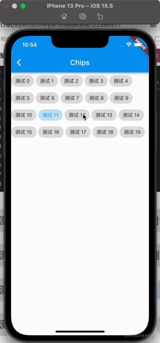
ChoiceChip
允许从一组选项中进行单个选择,创建一个类似于单选按钮的标签,本质上ChoiceChip也是一个RawChip,ChoiceChip本身不具备单选属性。
  int _selectedIndex = 0;
 Wrap(
            spacing: 5,
            children: List.generate(20, (index){
            return ChoiceChip(
                label: Text('测试 $index'),
                selected: _selectedIndex==index,
              onSelected: (v){
                  setState(() {
                    _selectedIndex =index;
                  });
              },
            );
          }).toList(),
          )
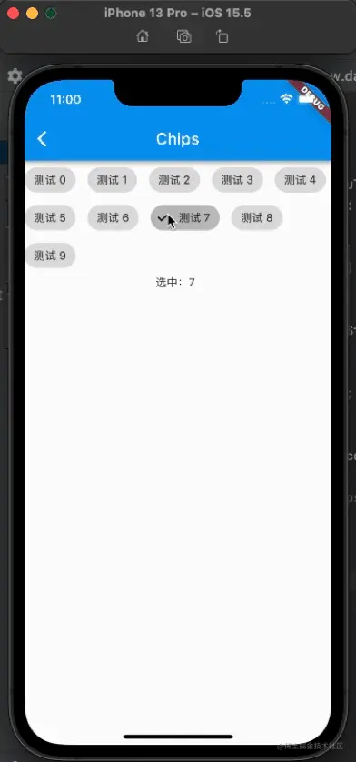
FilterChip
FilterChip可以作为过滤标签,本质上也是一个RawChip,用法如下:
  List<String> _filters = [];
 _buildFilterChip(){
    return Column(
      children: [
        Wrap(
          spacing: 15,
          children: List.generate(10, (index) {
            return FilterChip(
              label: Text('测试 $index'),
              selected: _filters.contains('$index'),
              onSelected: (v) {
                setState(() {
                  if(v){
                    _filters.add('$index');
                  }else{
                    _filters.removeWhere((f){
                      return f == '$index';
                    });
                  }
                });
              },
            );
          }).toList(),
        ),
        Text('选中:${_filters.join(',')}'),
      ],
    );
  }
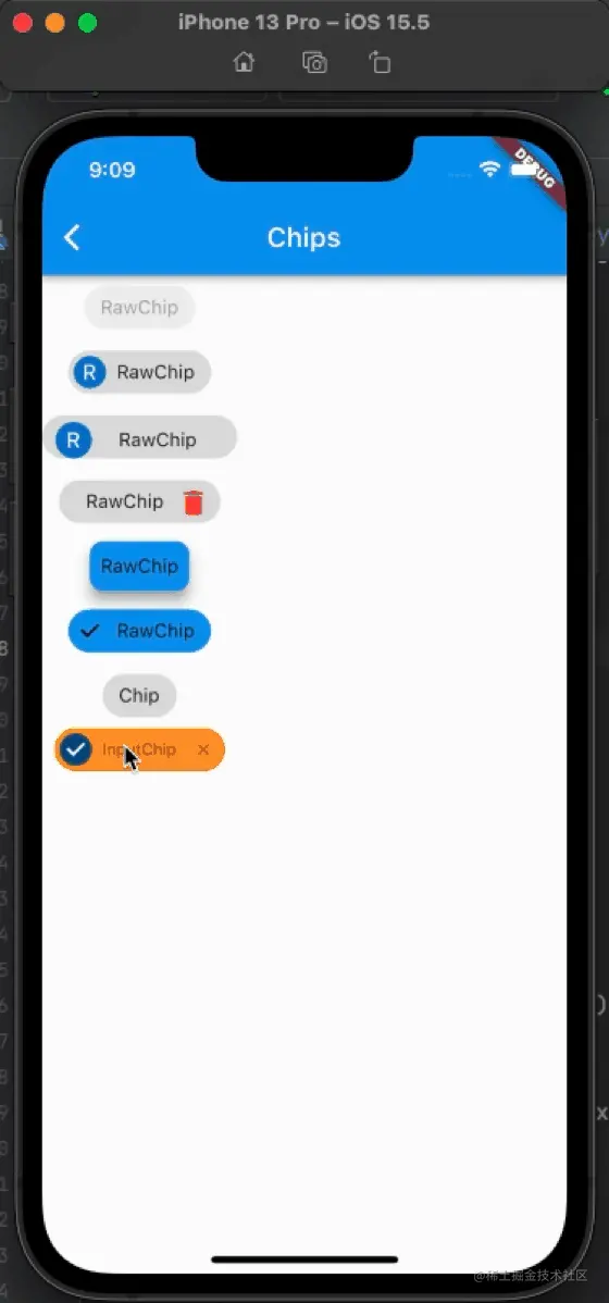
运行效果:
总结:
本篇主要讲了以下几种chip组件的用法案例:
- RawChip:是Material风格标签控件,此控件是其他标签控件的基类,通常情况下,不会直接创建此控件,而是使用其他的标签控件。
- InputChip:以紧凑的形式表示一条复杂的信息,例如实体(人,地方或事物)或对话文本。InputChip 本质上也是RawChip,用法和RawChip一样
- ChoiceChip:允许从一组选项中进行单个选择,创建一个类似于单选按钮的标签,本质上ChoiceChip也是一个RawChip,ChoiceChip本身不具备单选属性。
- FilterChip:可以作为过滤标签,本质上也是一个RawChip
- ActionChip:显示与主要内容有关的一组动作,本质上也是一个RawChip
- Chip:一个简单的标签控件,仅显示信息和删除相关属性,是一个简化版的RawChip,用法和RawChip一样
以上就是Flutter Widgets之标签类控件Chip详解的详细内容,更多关于Flutter Widgets标签类控件Chip的资料请关注猪先飞其它相关文章!
原文出处:https://juejin.cn/post/7155685641341108231
相关文章
- 这篇文章主要给大家介绍了关于C#创建自定义控件及添加自定义属性和事件使用的相关资料,文中通过示例代码介绍的非常详细,对大家学习或者使用C#具有一定的参考学习价值,需要的朋友们下面来一起学习学习吧...2020-06-25
- 这篇文章主要介绍了C#实现跨线程操作控件方法,主要采用异步访问方式实现,需要的朋友可以参考下...2020-06-25
- 这篇文章主要介绍了C# 如何设置label(标签)控件的背景颜色为透明,帮助大家更好的理解和使用c#,感兴趣的朋友可以了解下...2020-12-08
- 本篇文章是对C#中自定义控件的制作与使用实例进行了详细的分析介绍,需要的朋友参考下...2020-06-25
- 这篇文章主要为大家详细介绍了Bootstrap树形控件使用方法,感兴趣的小伙伴们可以参考一下...2016-01-29
- 这篇文章主要介绍了C#实现根据指定容器和控件名字获得控件的方法,其中包括了遍历与递归的应用,需要的朋友可以参考下...2020-06-25
- 这篇文章主要介绍了C#多线程与跨线程访问界面控件的方法,实例分析了C#多线程与跨线程访问空间的技巧,具有一定参考借鉴价值,需要的朋友可以参考下...2020-06-25
Repeater事件OnItemCommand取得行内控件的方法
这篇文章主要介绍了Repeater事件OnItemCommand取得行内控件的方法,有需要的朋友可以参考一下...2021-09-22- activex控件以前也叫做ole控件,它是微软ie支持的一种软件组件或对象,可以将其插入到web页面中,实现在浏览器端执行动态程序功能,以增强浏览器端的动态处理能力。通常activex控件都是用c++或vb语言开发,本文介绍另一种方式,使用c#语言开发activex控件。...2020-06-25
- 这篇文章主要介绍了C#自定义控件添加右键菜单的方法,本文用到control控件,专门自定义右键菜单,下面小编给大家整理下,有需要的小伙伴可以来参考下...2020-06-25
学习使用bootstarp基本控件(table、form、button)
这篇文章主要教会大家学习使用bootstarp基本控件,如table、form、button控件,感兴趣的小伙伴们可以参考一下...2016-04-16- 下面小编就为大家分享一篇基于C#调用OCX控件的常用方法推荐,具有很好的参考价值,希望对大家有所帮助。一起跟随小编过来看看吧...2020-06-25
C++ Custom Control控件向父窗体发送对应的消息
这篇文章主要介绍了C++ Custom Control控件向父窗体发送对应的消息的相关资料,需要的朋友可以参考下...2020-04-25- 这篇文章主要为大家详细介绍了javascript特殊日历控件的使用方法,展示了javascript日历控件实现效果,具有一定的参考价值,感兴趣的小伙伴们可以参考一下...2016-03-09
asp.net html控件的File控件实现多文件上传实例分享
asp.net中html控件的File控件实现多文件上传简单实例,开发工具vs2010使用c#语言,感兴趣的朋友可以了解下,必定是多文件上传值得学习,或许本文所提供的知识点对你有所帮助...2021-09-22- 这篇文章主要介绍了Swift在控件中添加点击手势的方法,本文讲解如何在tableview的headerview中添加点击手势的方法,需要的朋友可以参考下...2020-06-30
- 这篇文章主要为大家详细分享了laypage分页控件使用实例,具有一定的参考价值,感兴趣的小伙伴们可以参考一下...2016-05-20
- 这篇文章主要介绍了浅析Bootstrap验证控件的使用 的相关资料,非常不错具有参考借鉴价值,需要的朋友可以参考下...2016-06-24
- 这篇文章主要为大家详细介绍了利用jmSlip编写移动端顶部日历选择组件的方法,具有一定的参考价值,感兴趣的小伙伴们可以参考一下...2016-10-25
C#递归遍历窗体所有textbox控件并设置textbox事件的方法
这篇文章主要介绍了C#递归遍历窗体所有textbox控件并设置textbox事件的方法,包括针对textbox控件的递归遍历技巧与事件方法的设置技巧,需要的朋友可以参考下...2020-06-25