20分钟成功编写bootstrap响应式页面 就这么简单
最近发现一个叫 Bootstrap 的好东西,Bootstrap 是现在最流行的响应式 CSS 框架,它以移动设备优先,能够快速适应不同设备。使用它编写响应式页面快捷、方便,而且屏蔽了浏览器差异。使用了 Bootstrap 后,再也无法想象过去使用原始的 CSS 编写网页的悲惨生活了。
经过学习,我发现自己也具备了分分钟开发出一个高大上的页面的能力。本文将会为大家介绍 Bootstrap,并且带领大家一起实现一个响应式页面。
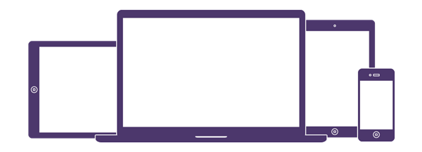
图 1. 移动优先,适应不同设备
一、安装
最简单的方式是直接在网页中引用内容分发网络(CDN)提供的 Bootstrap,当用户访问网页时,会从就近的服务器上获取资源。
清单 1. 从内容分发网络上获取 Bootstrap
<!-- Latest compiled and minified CSS -->
<link rel="stylesheet" href="bootstrap/3.3.4/css/bootstrap.min.css
">

<!-- Optional theme -->
<link rel="stylesheet" href="bootstrap/3.3.4/css/bootstrap-theme.min.css
">

<!-- Latest compiled and minified JavaScript -->
<script src="bootstrap/3.3.4/js/bootstrap.min.js">
</script>
还可以选择下载 Bootstrap 在本地部署。用户可以下载页面下载完整的 Bootstrap,也可以在定制页面根据项目需要,选择项目用到的功能,编译并下载一个简化版的 Bootstrap。下载完成后得到一个 zip 文件,解压后的目录结构如下所示:
清单 2. Bootstrap 目录结构
bootstrap/
├── css/
│ ├── bootstrap.css
│ ├── bootstrap.css.map
│ ├── bootstrap.min.css
│ ├── bootstrap-theme.css
│ ├── bootstrap-theme.css.map
│ └── bootstrap-theme.min.css
├── js/
│ ├── bootstrap.js
│ └── bootstrap.min.js
└── fonts/
├── glyphicons-halflings-regular.eot
├── glyphicons-halflings-regular.svg
├── glyphicons-halflings-regular.ttf
├── glyphicons-halflings-regular.woff
└── glyphicons-halflings-regular.woff2
这里我们主要关注三个简化后的文件:bootstrap.min.css 是 Bootstrap 的主要组成部分,包含了大量要用到的 CSS 类;bootstrap-theme.min.css 包含了可选的 Bootstrap 主题;bootstrap.min.js 提供了一些 JavaScript 方法,需要注意的是 Bootstrap 依赖于 jQuery,因此使用 bootstrap.min.js 前必须引入 jQuery。和使用内容分发网络一样,我们使用相对路径在自己的页面中引入相应的 CSS 和 JavaScript。在实际开发中,我们常常使用 Bootstrap 提供的模板作为起点,该模板引入了响应式页面需要的元数据和 Bootstrap,开发者可在此基础之上编写自己的响应式页面:
清单 3. Bootstrap 基础模板
<!DOCTYPE html>
<html lang="en">
<head>
<meta charset="utf-8">
<meta http-equiv="X-UA-Compatible" content="IE=edge">
<meta name="viewport" content="width=device-width, initial-scale=1">
<!-- The above 3 meta tags *must* come first in the head; any other
 head content must come *after* these tags -->
<title>Bootstrap 101 Template</title>

<!-- Bootstrap -->
<link href="css/bootstrap.min.css" rel="stylesheet">

<!-- HTML5 shim and Respond.js for IE8 support of HTML5 elements and media queries -->
<!-- WARNING: Respond.js doesn't work if you view the page via file:// -->
<!--[if lt IE 9]>
<script src="https://oss.maxcdn.com/html5shiv/3.7.2/html5shiv.min.js"></script>
<script src="https://oss.maxcdn.com/respond/1.4.2/respond.min.js"></script>
<![endif]-->
</head>
<body>
<h1>Hello, world!</h1>

<!-- jQuery (necessary for Bootstrap's JavaScript plugins) -->
<script src="https://ajax.googleapis.com/ajax/libs/jquery/1.11.2/jquery.min.js"></script>
<!-- Include all compiled plugins (below), or include individual files as needed -->
<script src="js/bootstrap.min.js"></script>
</body>
</html>
二、CSS
Bootstrap 首先是一个 CSS 框架,它预定义了很多 CSS 类,开发者只需要为 HTML 元素添加适当的 CSS 类,就能得到想要的样式,可以完成页面的布局、排版等功能。Bootstrap 提供的 CSS 功能异常强大,本文将重点放在其提供的网格系统上,对于其他功能,只在应用时顺便提及。您若想了解更多功能,可参考官方文档。
容器
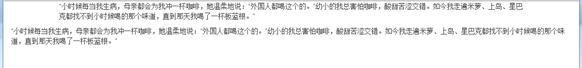
使用 Bootstrap 布局时,需要将 HTML 元素包含在一个容器(.container)里,Bootstrap 提供了两种容器:.container 和 .container-fluid。前者将内容固定宽度居中显示,后者让内容横向撑满整个浏览器窗口,如下所示:
清单 4. .container 和 .container-fluid
<div class="container">
<p>“小时候每当我生病,母亲都会为我冲一杯咖啡,她温柔地说:“外国人都喝这个的。
”幼小的我总害怕咖啡,酸甜苦涩交错。如今我走遍米萝、上岛、星巴克都找不到小时候喝的那个味道,
直到那天我喝了一杯板蓝根。” </p>
</div>

<div class="container-fluid">
<p>“小时候每当我生病,母亲都会为我冲一杯咖啡,她温柔地说:“外国人都喝这个的。”
幼小的我总害怕咖啡,酸甜苦涩交错。如今我走遍米萝、上岛、星巴克都找不到小时候喝的那个味道,
直到那天我喝了一杯板蓝根。” </p>
</div>
下图是显示在浏览器中的样子:
图 2. 容器
网格系统
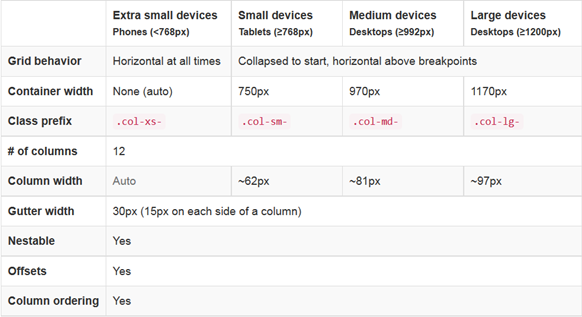
和我们在《编写第一个响应式页面》中设计的网格系统一样,Bootstrap 也将页面分为行(.row),每行 12 列(.col-md-*)。行必须包含在容器里,根据屏幕大小不同,列又分为.col-xs-、.col-sm-、.col-md-、.col-lg-,分别对应手机(<768px)、平板(≥768px)、中等屏幕电脑(≥992px)和大屏幕电脑(≥1200px)。其中出现的这些像素称为临界点,每当浏览器大小或屏幕尺寸从一个临界点到达另一个临界点时,相应的 CSS 类就会起作用,页面布局就会发生变化。详见下图:
图 3.网格系统
怎么理解上面这个表格呢?假如在电脑上浏览页面,需要将页面分为三列,分别占行宽的 1/4、2/4、1/4,则可编写代码如下:
清单 5. 一行分三列
<div class="row">
<div class="col-md-3">.col-md-3</div>
<div class="col-md-6">.col-md-6</div>
<div class="col-md-3">.col-md-3</div>
</div>
打开浏览器,可以看到它们各自占据了 12 列中的 3、6、3 列,加起来恰好是 12 列。如果我们缩小浏览器窗口,直到其小于 970px,此时会发现变成了三行,堆在一起显示。除过.col-xs-,其他 CSS 类的行为都一样,在屏幕尺寸小于其临界点时,会堆起来显示,只有在屏幕尺寸大于其临界点时,才按列显示,而.col-xs- 在任何情况下都按列显示。
对应不同屏幕尺寸的 CSS 类可以混合使用,比如我想让一个页面在电脑上显示 3 列,在手机上显示成 2 列,则可编写代码如下,在手机上,第三列会换行到下一行显示,并且占据行宽的一半:
清单 6. 在电脑和手机上显示不同数量的列
<div class="row">
<div class="col-xs-6 col-md-3">.col-md-3</div>
<div class="col-xs-6 col-md-6">.col-md-6</div>
<div class="col-xs-6 col-md-3">.col-md-3</div>
</div>
如果希望在所有设备上显示相同的列,只需要定义最小尺寸的.col-xs- 即可,布局会自动扩展到更大尺寸,反之则不成立:
清单 7. 所有设备上显示同数量的列
<div class="row">
<div class="col-xs-6">.col-xs-6</div>
<div class="col-xs-6">.col-xs-6</div>
</div>
还可以给列一定的偏移量,比如第一列占行宽的 1/4,我们希望第二列向右偏移 6 列,占用行末的 3 列:
清单 8. 列偏移
<div class="row">
<div class="col-md-3">.col-md-3</div>
<div class="col-md-3 col-md-offset-6">.col-md-3</div>
</div>
列的顺序也可以通过.col-md-push-* 和 .col-md-pull-* 调整,它们的含义是将某元素向后推或向前拉若干列,开发者可使用该特性,将重要内容在手机显示时,拉到前面:
清单 9. 推拉列
<div class="row">
<div class="col-md-9 col-md-push-3">.col-md-9 .col-md-push-3</div>
<div class="col-md-3 col-md-pull-9">.col-md-3 .col-md-pull-9</div>
</div>
更让人兴奋的是,这种网格系统还可以嵌套,这样就能进行各种各样复杂的布局了:
清单 10. 嵌套
<div class="row">
<div class="col-sm-9">
Level 1: .col-sm-9
<div class="row">
<div class="col-xs-8 col-sm-6">
Level 2: .col-xs-8 .col-sm-6
</div>
<div class="col-xs-4 col-sm-6">
Level 2: .col-xs-4 .col-sm-6
</div>
</div>
<div class="col-sm-3">
Level 1: .col-sm-3
</div>
</div>
</div>
上面的代码总体上分成两列,其中第一列又嵌套了两列。
Bootstrap 的网格功能为网页布局提供了各种可能性,而且使用起来非常简单,下面我们不妨通过一个案例,看看使用 Bootstrap 编写一个响应式页面是多么简单。
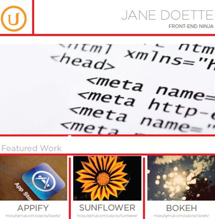
三、实战
假设现在要实现一个如下面的图片所示的网页:
图 4. 网页设计
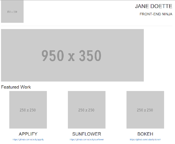
首先,我们先将网页元素划分成相应的行和列,下图是作者的划分:
图 5. 将网页设计划分成行和列
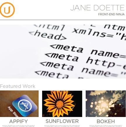
据此,定义我们的 HTML 结构,并添加适当的 Bootstrap CSS 类:
清单 11. 定义 HTML 结构
<div class="container">
<div class="row">
<div class="col-md-3">
<img src="http://placehold.it/150x150">
</div>
<div class="col-md-9">
<h1>Jane Doette</h1>
<h3>front-end ninja</h3>
</div>
</div>
<hr>
<div class="row">
<div class="col-md-12">
<img src="http://placehold.it/950x350">
</div>
</div>
<div class="row">
<div class="col-md-12">
<h2>Featured Work</h2>
</div>
</div>
<div class="row">
<div class="col-md-4">
<img src="http://placehold.it/250x250">
<h2>applify</h2>
<a href="https://github.com/udacity/applify">https://github.com/udacity/applify</a>
</div>
<div class="col-md-4">
<img src="http://placehold.it/250x250">
<h2>sunflower</h2>
<a href="https://github.com/udacity/sunflower">https://github.com/udacity/sunflower</a>
</div>
<div class="col-md-4">
<img src="http://placehold.it/250x250">
<h2>bokeh</h2>
<a href="https://github.com/udacity/bokeh">https://github.com/udacity/bokeh</a>
</div>
</div>
</div>
作者编写上述代码花了不到 10 分钟,由于没有图片,作者使用了网上提供的占位图片。在浏览器里打开该页面,已经接近设计了,但字体、大小写、排版还与设计不符。接下来就要进行微调,浏览 Bootstrap 文档,可以发现相关的 CSS 类,最终完成的效果如下图所示:
图 6. 实现效果
更有意思的是,当你缩小浏览器窗口,或者从手机上访问该页面时,会发现它已经是一个简单的响应式页面了,而我们并没有添加任何额外代码!看一下时间,总共花了不到 20 分钟,我也兑现了分分钟编写一个响应式页面的承诺。
相关文章
- 这篇文章主要介绍了Bootstrap Table使用整理(二)的相关资料,需要的朋友可以参考下...2017-06-15
基于BootStrap Metronic开发框架经验小结【八】框架功能总体界面介绍
这篇文章主要介绍了基于BootStrap Metronic开发框架经验小结【八】框架功能总体界面介绍 的相关资料,需要的朋友可以参考下...2016-05-14- 这篇文章主要为大家分享了Bootstrap教程JS插件滚动监听学习笔记,内容很详细,感兴趣的小伙伴们可以参考一下...2016-05-20
- 这篇文章主要教大家如何利用Bootstrap3制作图片轮播效果,具有一定的参考价值,感兴趣的小伙伴们可以参考一下...2016-05-14
- 在网页中,经常见到进度条效果,那么这些个性的进度条组件效果是怎么实现的呢,下面脚本之家小编给大家分享Bootstrap进度条组件知识详解,感兴趣的朋友要求学习吧...2016-05-04
JS树形菜单组件Bootstrap TreeView使用方法详解
这篇文章主要为大家详细介绍了js组件Bootstrap TreeView使用方法,本文一部分针对于bootstrap的treeview的实践,另一部分是介绍自己写的树形菜单,具有一定的参考价值,感兴趣的小伙伴们可以参考一下...2017-01-09- 这篇文章主要为大家详细介绍了Bootstrap树形控件使用方法,感兴趣的小伙伴们可以参考一下...2016-01-29
- 这篇文章主要为大家详细介绍了Bootstrap选项卡学习笔记,具有一定的参考价值,感兴趣的小伙伴们可以参考一下...2017-02-19
基于BootStrap的Metronic框架实现页面链接收藏夹功能按钮移动收藏记录(使用Sortable进行拖动排序)
这篇文章主要介绍了基于BootStrap的Metronic框架实现页面链接收藏夹功能按钮移动收藏记录(使用Sortable进行拖动排序)的相关资料,非常不错,需要的朋友可以参考下...2016-09-01- 这篇文章主要为大家详细解析了BootStrap图片样式、辅助类样式和CSS组件源码,具有一定的参考价值,感兴趣的小伙伴们可以参考一下...2017-01-23
基于Bootstrap的Metronic框架实现页面链接收藏夹功能
本文给大家介绍基于Metronic的Bootstrap开发框架实现页面链接收藏夹功能,非常不错,具有参考借鉴价值,感兴趣的朋友一起学习吧...2016-09-01- 本文通过实例代码给大家介绍了bootstrap导航条效果,代码简单易懂,非常不错,具有参考借鉴价值,需要的的朋友参考下吧...2017-05-22
- Bootstrap 是一个用于快速开发 Web 应用程序和网站的前端框架,主要基于 HTML、CSS、JAVASCRIPT 的。接下来通过本文给大家介绍BootStrap 附加导航组件的知识,感兴趣的朋友一起学习吧...2016-07-29
Bootstrap中文本框的宽度变窄并且加入一副验证码图片的实现方法
这篇文章主要介绍了Bootstrap中文本框的宽度变窄并且加入一副验证码图片的实现方法的相关资料,非常不错,具有参考借鉴价值,需要的朋友可以参考下...2016-06-24- 这篇文章主要介绍了Bootstrap Table使用整理(四)之工具栏的相关资料,需要的朋友可以参考下...2017-06-15
- 这篇文章主要介绍了BootStrap和jQuery相结合实现可编辑表格的相关资料,需要的朋友可以参考下...2016-04-23
基于Bootstrap实现Material Design风格表单插件 附源码下载
Jquery Material Form Plugin是一款基于Bootstrap的Material Design风格的jQuery表单插件。这篇文章主要介绍了基于Bootstrap的Material Design风格表单插件附源码下载,感兴趣的朋友参考下...2016-04-19BootStrap Progressbar 实现大文件上传的进度条的实例代码
这篇文章主要介绍了BootStrap Progressbar 实现大文件上传的进度条的实例代码的相关资料,非常不错,具有参考借鉴价值,需要的朋友可以参考下...2016-07-01BootStrap学习系列之Bootstrap Typeahead 组件实现百度下拉效果(续)
这篇文章主要介绍了BootStrap学习系列之Bootstrap Typeahead 组件实现百度下拉效果的相关资料,非常不错,具有参考借鉴价值,需要的朋友可以参考下...2016-07-25- bootstrap布局是应用得很广泛的一种网页布局方法,下面通过本文给大家介绍bootstrap页面缩小变形的快速解决办法,需要的朋友参考下吧...2017-02-08