Android 5.0 中Activity切换效果动画介绍及例
动画效果图如下: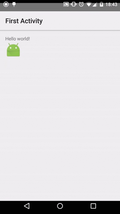
下面要介绍的其中一种Activity的切换效果(如上图).当前后两个Activity有共同的UI元素时候,适合用这种动画效果,给用户连贯性的体验.
实现步骤
1. 新建一个Android应用Project,里面有两个Activity;
2. 下面是MainActivity的代码和XML布局;
代码和布局都非常简单.解释一下onClick()方法的代码.
makeSceneTransactionAnimation()方法第二个参数是用来告诉指定共同的UI元素是哪一个,这里是shareView.
makeSceneTransactionAnimation()方法第三个参数是"robot",和XML布局里面的android:transactionName="robot"的值是一一对应的.
package com.example.garena.myapplication;
import android.app.ActionBar;
import android.app.Activity;
import android.app.ActivityOptions;
import android.content.Intent;
import android.os.Bundle;
import android.view.View;
public class MainActivity extends Activity {
@Override
protected void onCreate(Bundle savedInstanceState) {
super.onCreate(savedInstanceState);
setContentView(R.layout.activity_main);
final View shareView = findViewById(R.id.share_element_image_view);
shareView.setOnClickListener(new View.OnClickListener() {
@Override
public void onClick(View v) {
Intent intent = new Intent(MainActivity.this, SecondActivity.class);
ActivityOptions options = ActivityOptions
.makeSceneTransitionAnimation(MainActivity.this, shareView, "robot");
startActivity(intent, options.toBundle());
}
});
ActionBar actionBar = getActionBar();
if (actionBar != null) {
actionBar.setTitle(R.string.first_activity);
}
}
}
<LinearLayout xmlns:android="http://schemas.android.com/apk/res/android"
xmlns:tools="http://schemas.android.com/tools"
android:layout_width="match_parent"
android:layout_height="match_parent"
android:orientation="vertical"
android:paddingBottom="@dimen/activity_vertical_margin"
android:paddingLeft="@dimen/activity_horizontal_margin"
android:paddingRight="@dimen/activity_horizontal_margin"
android:paddingTop="@dimen/activity_vertical_margin"
tools:context=".MainActivity">
<TextView
android:layout_width="wrap_content"
android:layout_height="wrap_content"
android:text="@string/hello_world" />
<ImageView
android:id="@+id/share_element_image_view"
android:layout_width="wrap_content"
android:layout_height="wrap_content"
android:src="@drawable/ic_launcher"
android:transitionName="robot" />
</LinearLayout>
3. 下面是SecondActivity的代码和布局;
在onClick()方法里面,调用finishAfterTransaction()来finish activity.
在XML布局里面,同样是需要用android:transactionName="roboto"来标识共同的UI元素.
package com.example.garena.myapplication;
import android.app.ActionBar;
import android.app.Activity;
import android.os.Bundle;
import android.view.View;
public class SecondActivity extends Activity {
@Override
protected void onCreate(Bundle savedInstanceState) {
super.onCreate(savedInstanceState);
setContentView(R.layout.second_activity);
ActionBar actionBar = getActionBar();
if (actionBar != null) {
actionBar.setTitle(R.string.second_activity);
}
View btnBack = findViewById(R.id.btn_back);
btnBack.setOnClickListener(new View.OnClickListener() {
@Override
public void onClick(View v) {
finishAfterTransition();
}
});
}
}
<?xml version="1.0" encoding="utf-8"?>
<LinearLayout xmlns:android="http://schemas.android.com/apk/res/android"
android:layout_width="match_parent"
android:layout_height="match_parent"
android:gravity="center"
android:orientation="vertical">
<ImageView
android:id="@+id/title_icon_image_view"
android:layout_width="wrap_content"
android:layout_height="wrap_content"
android:src="@drawable/ic_launcher"
android:transitionName="robot" />
<Button
android:id="@+id/btn_back"
android:layout_width="wrap_content"
android:layout_height="wrap_content"
android:text="@string/back" />
</LinearLayout>
4. 运行效果(如上图);
从最终运行的效果图可以看到,点击小机器人的图标进入SecondActivity时,能看到小机器人图标移动到SecondActivity这个小机器人图标的位置.
点击SecondActivity的Back按钮,小机器人图标会移动到MainActivity中小机器人图标的位置.
今天来看一个通过重写Button来动态实现一些效果,如圆角矩形、圆形、按下改变字体,改变背景色,改变背景图等
在此说明一下,这种实现方式绝对不是唯一的,而且通过xml文件即可简单实现,这样做只是为了将控件的样式完全由代码实现,更方便打包应用于其他项目
下面来看几张效果图:

图1 初始状态 图2 按下第一行的TEXT0
图3 按下第二行的TEXT1 图4 按下第三行的TEXT2,按住截屏时,没有截到Toast的提示
下面看代码,共两个类,一个布局文件
1 ButtonM.java:重写Button,可单独打包应用于其他项目
在此说明一下,这种实现方式绝对不是唯一的,而且通过xml文件即可简单实现,这样做只是为了将控件的样式完全由代码实现,更方便打包应用于其他项目
package landptf.control;
import android.content.Context;
import android.graphics.Color;
import android.graphics.drawable.GradientDrawable;
import android.util.AttributeSet;
import android.view.Gravity;
import android.view.MotionEvent;
import android.view.View;
import android.widget.Button;
/**
* 重写Button,自定义Button样式
* @author landptf
* @date 2015-6-8
*/
public class ButtonM extends Button{
private GradientDrawable gradientDrawable;//控件的样式
private String backColors = "";//背景色,String类型
private int backColori = 0;//背景色,int类型
private String backColorSelecteds = "";//按下后的背景色,String类型
private int backColorSelectedi = 0;//按下后的背景色,int类型
private int backGroundImage = 0;//背景图,只提供了Id
private int backGroundImageSeleted = 0;//按下后的背景图,只提供了Id
private String textColors = "";//文字颜色,String类型
private int textColori = 0;//文字颜色,int类型
private String textColorSeleteds = "";//按下后的文字颜色,String类型
private int textColorSeletedi = 0;//按下后的文字颜色,int类型
private float radius = 8;//圆角半径
private int shape = 0;//圆角样式,矩形、圆形等,由于矩形的Id为0,默认为矩形
private Boolean fillet = false;//是否设置圆角
public ButtonM(Context context, AttributeSet attrs, int defStyle) {
super(context, attrs, defStyle);
init();
}
public ButtonM(Context context, AttributeSet attrs) {
this(context, attrs, 0);
}
public ButtonM(Context context) {
this(context, null);
}
private void init() {
//将Button的默认背景色改为透明,本人不喜欢原来的颜色
if (fillet) {
if (gradientDrawable == null) {
gradientDrawable = new GradientDrawable();
}
gradientDrawable.setColor(Color.TRANSPARENT);
}else {
setBackgroundColor(Color.TRANSPARENT);
}
//设置文字默认居中
setGravity(Gravity.CENTER);
//设置Touch事件
setOnTouchListener(new OnTouchListener() {
@Override
public boolean onTouch(View arg0, MotionEvent event) {
//按下改变样式
setColor(event.getAction());
//此处设置为false,防止Click事件被屏蔽
return false;
}
});
}
//改变样式
private void setColor(int state){
if (state == MotionEvent.ACTION_DOWN) {
//按下
if (backColorSelectedi != 0) {
//先判断是否设置了按下后的背景色int型
if (fillet) {
if (gradientDrawable == null) {
gradientDrawable = new GradientDrawable();
}
gradientDrawable.setColor(backColorSelectedi);
}else {
setBackgroundColor(backColorSelectedi);
}
}else if (!backColorSelecteds.equals("")) {
if (fillet) {
if (gradientDrawable == null) {
gradientDrawable = new GradientDrawable();
}
gradientDrawable.setColor(Color.parseColor(backColorSelecteds));
}else {
setBackgroundColor(Color.parseColor(backColorSelecteds));
}
}
//判断是否设置了按下后文字的颜色
if (textColorSeletedi != 0) {
setTextColor(textColorSeletedi);
}else if (!textColorSeleteds.equals("")) {
setTextColor(Color.parseColor(textColorSeleteds));
}
//判断是否设置了按下后的背景图
if (backGroundImageSeleted != 0) {
setBackgroundResource(backGroundImageSeleted);
}
}
if (state == MotionEvent.ACTION_UP) {
//抬起
if (backColori == 0 && backColors.equals("")) {
//如果没有设置背景色,默认改为透明
if (fillet) {
if (gradientDrawable == null) {
gradientDrawable = new GradientDrawable();
}
gradientDrawable.setColor(Color.TRANSPARENT);
}else {
setBackgroundColor(Color.TRANSPARENT);
}
}else if(backColori != 0){
if (fillet) {
if (gradientDrawable == null) {
gradientDrawable = new GradientDrawable();
}
gradientDrawable.setColor(backColori);
}else {
setBackgroundColor(backColori);
}
}else {
if (fillet) {
if (gradientDrawable == null) {
gradientDrawable = new GradientDrawable();
}
gradientDrawable.setColor(Color.parseColor(backColors));
}else {
setBackgroundColor(Color.parseColor(backColors));
}
}
//如果为设置字体颜色,默认为黑色
if (textColori == 0 && textColors.equals("")) {
setTextColor(Color.BLACK);
}else if (textColori != 0) {
setTextColor(textColori);
}else {
setTextColor(Color.parseColor(textColors));
}
if (backGroundImage != 0) {
setBackgroundResource(backGroundImage);
}
}
}
/**
* 设置按钮的背景色,如果未设置则默认为透明
* @param backColor
*/
public void setBackColor(String backColor) {
this.backColors = backColor;
if (backColor.equals("")) {
if (fillet) {
if (gradientDrawable == null) {
gradientDrawable = new GradientDrawable();
}
gradientDrawable.setColor(Color.TRANSPARENT);
}else {
setBackgroundColor(Color.TRANSPARENT);
}
}else {
if (fillet) {
if (gradientDrawable == null) {
gradientDrawable = new GradientDrawable();
}
gradientDrawable.setColor(Color.parseColor(backColor));
}else {
setBackgroundColor(Color.parseColor(backColor));
}
}
}
/**
* 设置按钮的背景色,如果未设置则默认为透明
* @param backColor
*/
public void setBackColor(int backColor) {
this.backColori = backColor;
if (backColori == 0) {
if (fillet) {
if (gradientDrawable == null) {
gradientDrawable = new GradientDrawable();
}
gradientDrawable.setColor(Color.TRANSPARENT);
}else {
setBackgroundColor(Color.TRANSPARENT);
}
}else {
if (fillet) {
if (gradientDrawable == null) {
gradientDrawable = new GradientDrawable();
}
gradientDrawable.setColor(backColor);
}else {
setBackgroundColor(backColor);
}
}
}
/**
* 设置按钮按下后的颜色
* @param backColorSelected
*/
public void setBackColorSelected(int backColorSelected) {
this.backColorSelectedi = backColorSelected;
}
/**
* 设置按钮按下后的颜色
* @param backColorSelected
*/
public void setBackColorSelected(String backColorSelected) {
this.backColorSelecteds = backColorSelected;
}
/**
* 设置按钮的背景图
* @param backGroundImage
*/
public void setBackGroundImage(int backGroundImage) {
this.backGroundImage = backGroundImage;
if (backGroundImage != 0) {
setBackgroundResource(backGroundImage);
}
}
/**
* 设置按钮按下的背景图
* @param backGroundImageSeleted
*/
public void setBackGroundImageSeleted(int backGroundImageSeleted) {
this.backGroundImageSeleted = backGroundImageSeleted;
}
/**
* 设置按钮圆角半径大小
* @param radius
*/
public void setRadius(float radius) {
if (gradientDrawable == null) {
gradientDrawable = new GradientDrawable();
}
gradientDrawable.setCornerRadius(radius);
}
/**
* 设置按钮文字颜色
* @param textColor
*/
public void setTextColors(String textColor) {
this.textColors = textColor;
setTextColor(Color.parseColor(textColor));
}
/**
* 设置按钮文字颜色
* @param textColor
*/
public void setTextColori(int textColor) {
this.textColori = textColor;
setTextColor(textColor);
}
/**
* 设置按钮按下的文字颜色
* @param textColor
*/
public void setTextColorSelected(String textColor) {
this.textColorSeleteds = textColor;
}
/**
* 设置按钮按下的文字颜色
* @param textColor
*/
public void setTextColorSelected(int textColor) {
this.textColorSeletedi = textColor;
}
/**
* 按钮的形状
* @param shape
*/
public void setShape(int shape) {
this.shape = shape;
}
/**
* 设置其是否为圆角
* @param fillet
*/
@SuppressWarnings("deprecation")
public void setFillet(Boolean fillet) {
this.fillet = fillet;
if (fillet) {
if (gradientDrawable == null) {
gradientDrawable = new GradientDrawable();
}
//GradientDrawable.RECTANGLE
gradientDrawable.setShape(shape);
gradientDrawable.setCornerRadius(radius);
setBackgroundDrawable(gradientDrawable);
}
}
}
2 activity_buttonm.xml 布局文件,为了演示效果定义了三个空的LinearLayout,下面将分别为其添加子控件
<?xml version="1.0" encoding="utf-8"?>
<LinearLayout xmlns:android="http://schemas.android.com/apk/res/android"
android:layout_width="match_parent"
android:layout_height="match_parent"
android:orientation="vertical" >
<LinearLayout
android:id="@+id/ll_button1"
android:layout_width="match_parent"
android:layout_height="wrap_content"
android:layout_marginTop="30dp"
android:orientation="horizontal">
</LinearLayout>
<LinearLayout
android:id="@+id/ll_button2"
android:layout_width="match_parent"
android:layout_height="wrap_content"
android:layout_marginTop="30dp"
android:orientation="horizontal">
</LinearLayout>
<LinearLayout
android:id="@+id/ll_button3"
android:layout_width="match_parent"
android:layout_height="wrap_content"
android:layout_marginTop="30dp"
android:orientation="horizontal">
</LinearLayout>
</LinearLayout>
3 ButtonMActivity.java:ButtonM测试类
package landptf.control;
import android.app.Activity;
import android.graphics.Color;
import android.graphics.drawable.GradientDrawable;
import android.os.Bundle;
import android.view.View;
import android.view.View.OnClickListener;
import android.view.ViewGroup.LayoutParams;
import android.widget.LinearLayout;
import android.widget.Toast;
/**
* ButtonM测试类
* @author landptf
* @date 2015-6-8
*/
public class ButtonMActivity extends Activity{
//定义三个空布局用来装载Button控件,只为演示效果,实际开发中不推荐使用
private LinearLayout llButtonM1;
private LinearLayout llButtonM2;
private LinearLayout llButtonM3;
//定义三个ButtonM数组
private ButtonM[] buttonM1;
private ButtonM[] buttonM2;
private ButtonM[] buttonM3;
//定义两组颜色值,按下与未按下的按钮背景色
private static final String[] colorList = {"#7067E2","#FF618F","#B674D2","#00C2EB"};
private static final String[] colorSelectedList = {"#3C3779","#88354C","#613E70","#00677D"};
@Override
protected void onCreate(Bundle savedInstanceState) {
super.onCreate(savedInstanceState);
setContentView(R.layout.activity_buttonm);
initView();
}
//初始化控件
private void initView() {
//实例化布局控件
llButtonM1 = (LinearLayout) findViewById(R.id.ll_button1);
llButtonM2 = (LinearLayout) findViewById(R.id.ll_button2);
llButtonM3 = (LinearLayout) findViewById(R.id.ll_button3);
//实例化控件数组,各定义4个
buttonM1 = new ButtonM[4];
buttonM2 = new ButtonM[4];
buttonM3 = new ButtonM[4];
//获取屏幕的宽度,每行四个Button,间隙为60共300,除4为每个控件的宽度
@SuppressWarnings("deprecation")
int btnWidth = (getWindowManager().getDefaultDisplay().getWidth() - 300)/4;
//定义第一个布局
LinearLayout.LayoutParams lp1;
for (int i = 0; i < 4; i++) {
//为buttonM1设置样式,直角矩形
buttonM1[i] = new ButtonM(this);
//字体颜色
buttonM1[i].setTextColori(android.graphics.Color.WHITE);
//字体大小
buttonM1[i].setTextSize(14);
//背景色
buttonM1[i].setBackColor(Color.parseColor(colorList[i]));
//选中的背景色
buttonM1[i].setBackColorSelected(Color.parseColor(colorSelectedList[i]));
//文字提示
buttonM1[i].setText("TEXT" + i);
//此处设置Id的值为i,否则onClick中v.getId()将永远为-1
buttonM1[i].setId(i);
//定义buttonM1的布局,宽度自适应,高度为宽度的0.6倍,权重为1
//也可以写成lp1 = new LinearLayout.LayoutParams(btnWidth,(int) (btnWidth * 0.6));
lp1 = new LinearLayout.LayoutParams(LayoutParams.WRAP_CONTENT,(int) (btnWidth * 0.6), 1.0f);
//控件距离其右侧控件的距离,此处为60
lp1.setMargins(0,0,60,0);
buttonM1[i].setLayoutParams(lp1);
//设置buttonM1的点击事件
buttonM1[i].setOnClickListener(new OnClickListener() {
@Override
public void onClick(View v) {
Toast.makeText(ButtonMActivity.this, "您选择了第" + v.getId() + "个", Toast.LENGTH_SHORT).show();
}
});
//设置PaddingLeft为60
llButtonM1.setPadding(60, 0, 0, 0);
//将buttonM1添加到llButtonM1中
llButtonM1.addView(buttonM1[i]);
}
//定义第二个布局
LinearLayout.LayoutParams lp2;
for (int i = 0; i < 4; i++) {
//为buttonM2设置样式,圆角矩形
buttonM2[i] = new ButtonM(this);
buttonM2[i].setTextColori(android.graphics.Color.WHITE);
buttonM2[i].setTextSize(14);
//设置是否为圆角
buttonM2[i].setFillet(true);
//设置圆角的半径大小
buttonM2[i].setRadius(18);
buttonM2[i].setBackColor(Color.parseColor(colorList[i]));
buttonM2[i].setBackColorSelected(Color.parseColor(colorSelectedList[i]));
buttonM2[i].setText("TEXT" + i);
buttonM2[i].setId(i);
lp2 = new LinearLayout.LayoutParams(LayoutParams.WRAP_CONTENT,(int) (btnWidth * 0.6), 1.0f);
lp2.setMargins(0,0,60,0);
buttonM2[i].setLayoutParams(lp2);
buttonM2[i].setOnClickListener(new OnClickListener() {
@Override
public void onClick(View v) {
Toast.makeText(ButtonMActivity.this, "您选择了第" + v.getId() + "个", Toast.LENGTH_SHORT).show();
}
});
llButtonM2.setPadding(60, 0, 0, 0);
llButtonM2.addView(buttonM2[i]);
}
//定义第三个布局
LinearLayout.LayoutParams lp3;
for (int i = 0; i < 4; i++) {
//为buttonM3设置样式,圆形
buttonM3[i] = new ButtonM(this);
buttonM3[i].setTextColori(android.graphics.Color.WHITE);
buttonM3[i].setTextSize(14);
//设置为圆形,默认为矩形,GradientDrawable.RECTANGLE
buttonM3[i].setShape(GradientDrawable.OVAL);
buttonM3[i].setFillet(true);
buttonM3[i].setBackColor(Color.parseColor(colorList[i]));
buttonM3[i].setBackColorSelected(Color.parseColor(colorSelectedList[i]));
buttonM3[i].setText("TEXT" + i);
buttonM3[i].setId(i);
lp3 = new LinearLayout.LayoutParams(btnWidth,btnWidth);
lp3.setMargins(0,0,60,0);
buttonM3[i].setLayoutParams(lp3);
buttonM3[i].setOnClickListener(new OnClickListener() {
@Override
public void onClick(View v) {
Toast.makeText(ButtonMActivity.this, "您选择了第" + v.getId() + "个", Toast.LENGTH_SHORT).show();
}
});
llButtonM3.setPadding(60, 0, 0, 0);
llButtonM3.addView(buttonM3[i]);
}
}
}
注释基本都说明了,可以慢慢积累这些控件,最终形成一个自己的控件库,在不同项目中完善,使之越来越强大
明天给大家介绍一下通过继承RelativeLayout,实现多个控件的组合,让不同项目应用,可避免每次都要重写
用户界面View之Dialog 对话框
一、AlertDialog常用方法
使用AlertDialog.Builder中的create()方法创建一个AlertDialog
setTitle();给对话框设置标题
setIcon();给对话框设置图标
setMessage();设置对话框的提示信息
setView() 给对话框设置自定义样式
setItems();设置对话框要显示的一个list,一般用于显示几个命令时
setSingleChoiceItems();设置对话框显示一个单选的List
setMultiChoiceItems();设置对话框显示一系列的复选框
setNeutralButton();普通按钮
setPositiveButton();给对话框添加"确定"按钮
setNegativeButton();给对话框添加"取消"按钮
示例一:


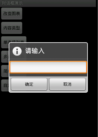
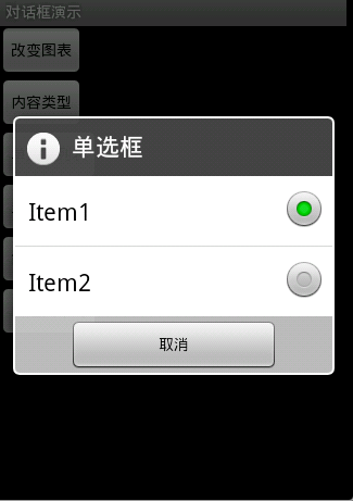
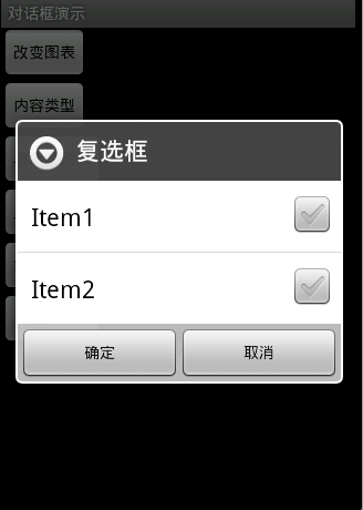
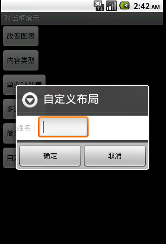
图1效果:该效果是当按返回按钮时弹出一个提示,来确保无误操作,采用常见的对话框样式。
代码:
创建对话框方法dialog()
protected void dialog() {
AlertDialog.Builder builder = new Builder(Main.this);
builder.setMessage("确认退出吗?");
builder.setTitle("提示");
builder.setPositiveButton("确认", new OnClickListener() {
@Override
public void onClick(DialogInterface dialog, int which) {
dialog.dismiss();
Main.this.finish();
}
});
builder.setNegativeButton("取消", new OnClickListener() {
@Override
public void onClick(DialogInterface dialog, int which) {
dialog.dismiss();
}
});
builder.create().show();
}
在onKeyDown(int keyCode, KeyEvent event)方法中调用此方法
public boolean onKeyDown(int keyCode, KeyEvent event) {
if (keyCode == KeyEvent.KEYCODE_BACK && event.getRepeatCount() == 0) {
dialog();
}
return false;
}
图2效果:改变了对话框的图表,添加了三个按钮
Dialog dialog = new AlertDialog.Builder(this).setIcon(
android.R.drawable.btn_star).setTitle("喜好调查").setMessage(
"你喜欢李连杰的电影吗?").setPositiveButton("很喜欢",
new OnClickListener() {
@Override
public void onClick(DialogInterface dialog, int which) {
// TODO Auto-generated method stub
Toast.makeText(Main.this, "我很喜欢他的电影。",
Toast.LENGTH_LONG).show();
}
}).setNegativeButton("不喜欢", new OnClickListener() {
@Override
public void onClick(DialogInterface dialog, int which) {
// TODO Auto-generated method stub
Toast.makeText(Main.this, "我不喜欢他的电影。", Toast.LENGTH_LONG)
.show();
}
}).setNeutralButton("一般", new OnClickListener() {
@Override
public void onClick(DialogInterface dialog, int which) {
// TODO Auto-generated method stub
Toast.makeText(Main.this, "谈不上喜欢不喜欢。", Toast.LENGTH_LONG)
.show();
}
}).create();
dialog.show();
图3效果:信息内容是一个简单的View类型
new AlertDialog.Builder(this).setTitle("请输入").setIcon(
android.R.drawable.ic_dialog_info).setView(
new EditText(this)).setPositiveButton("确定", null)
.setNegativeButton("取消", null).show();
图4效果:信息内容是一组单选框
new AlertDialog.Builder(this).setTitle("复选框").setMultiChoiceItems(
new String[] { "Item1", "Item2" }, null, null)
.setPositiveButton("确定", null)
.setNegativeButton("取消", null).show();
图5效果:信息内容是一组多选框
new AlertDialog.Builder(this).setTitle("单选框").setIcon(
android.R.drawable.ic_dialog_info).setSingleChoiceItems(
new String[] { "Item1", "Item2" }, 0,
new DialogInterface.OnClickListener() {
public void onClick(DialogInterface dialog, int which) {
dialog.dismiss();
}
}).setNegativeButton("取消", null).show();
图6效果:信息内容是一组简单列表项
new AlertDialog.Builder(this).setTitle("列表框").setItems(
new String[] { "Item1", "Item2" }, null).setNegativeButton(
"确定", null).show();
图7效果:信息内容是一个自定义的布局
1.布局文件
<?xml version="1.0" encoding="utf-8"?>
<LinearLayout xmlns:android="http://schemas.android.com/apk/res/android"
android:layout_height="wrap_content" android:layout_width="wrap_content"
android:background="#ffffffff" android:orientation="horizontal"
android:id="@+id/dialog">
<TextView android:layout_height="wrap_content"
android:layout_width="wrap_content"
android:id="@+id/tvname" android:text="姓名:" />
<EditText android:layout_height="wrap_content"
android:layout_width="wrap_content" android:id="@+id/etname" android:minWidth="100dip"/>
</LinearLayout>
2.调用代码
LayoutInflater inflater = getLayoutInflater();
View layout = inflater.inflate(R.layout.dialog,
(ViewGroup) findViewById(R.id.dialog));
new AlertDialog.Builder(this).setTitle("自定义布局").setView(layout)
.setPositiveButton("确定", null)
.setNegativeButton("取消", null).show();
一、使用include标签将可复用的组件抽取出来(引用布局)
二、使用merge标签减少布局的嵌套层次(merge相当于framelayout)
场景1:布局根结点是FrameLayout且不需要设置background或padding等属性,可以用merge代替。
场景2:某布局作为子布局被其他布局include时,使用merge当作该布局的顶节点,这样在被引入时,顶结点会自动被忽略。
三、使用ViewStub标签来加载一些不常用的布局
作用:ViewStub标签同include标签一样可以用来引入一个外部布局,不同的是,ViewStub引入的布局默认不会扩张,既不会占用显示也不会占用位置,从而在解析Layout时节省cpu和内存
示例一:include
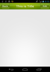
下面是res/layout/title.xml 布局文件:
<LinearLayout xmlns:android="http://schemas.android.com/apk/res/android"
xmlns:tools="http://schemas.android.com/tools"
android:layout_width="match_parent"
android:layout_height="wrap_content"
android:background="@drawable/title_bg" >
<Button
android:id="@+id/title_back"
android:layout_width="wrap_content"
android:layout_height="wrap_content"
android:layout_gravity="center"
android:layout_margin="5dp"
android:background="@drawable/back_bg"
android:text="Back"
android:textColor="#fff" />
<TextView
android:id="@+id/title_text"
android:layout_width="0dp"
android:layout_height="wrap_content"
android:layout_gravity="center"
android:layout_weight="1"
android:gravity="center"
android:text="This is Title"
android:textColor="#fff"
android:textSize="25sp" />
<Button
android:id="@+id/title_edit"
android:layout_width="wrap_content"
android:layout_height="wrap_content"
android:layout_gravity="center"
android:layout_margin="5dp"
android:background="@drawable/edit_bg"
android:text="Edit"
android:textColor="#fff" />
下面是res/layout/activity_main.xml 布局文件:
<LinearLayout xmlns:android="http://schemas.android.com/apk/res/android"
xmlns:tools="http://schemas.android.com/tools"
android:layout_width="match_parent"
android:layout_height="wrap_content" >
示例二:merge
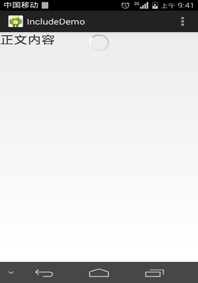
下面是res/layout/progress.xml 布局文件:
<merge xmlns:android="http://schemas.android.com/apk/res/android"
android:layout_width="match_parent"
android:layout_height="match_parent"
android:orientation="vertical" >
<ProgressBar
android:layout_width="wrap_content"
android:layout_height="wrap_content"
android:layout_gravity="center" />
下面是res/layout/activity_main.xml 布局文件:
<LinearLayout xmlns:android="http://schemas.android.com/apk/res/android"
xmlns:tools="http://schemas.android.com/tools"
android:layout_width="match_parent"
android:layout_height="wrap_content"
android:orientation="vertical" >
<FrameLayout
android:layout_width="match_parent"
android:layout_height="wrap_content" >
<TextView
android:layout_width="wrap_content"
android:layout_height="wrap_content"
android:text="正文内容"
android:textSize="25sp" />
示例三:ViewStub
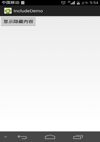
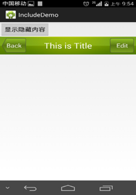
<LinearLayout xmlns:android="http://schemas.android.com/apk/res/android"
xmlns:tools="http://schemas.android.com/tools"
android:layout_width="match_parent"
android:layout_height="wrap_content"
android:orientation="vertical" >
<Button
android:id="@+id/button"
android:layout_width="wrap_content"
android:layout_height="wrap_content"
android:text="显示隐藏内容"/>
<ViewStub
android:id="@+id/id_viewStub"
android:layout_width="match_parent"
android:layout_height="wrap_content"
android:layout="@layout/title"/>
下面是MainActivity.java主界面文件:
public class MainActivity extends Activity {
private Button b;
private ViewStub stub;
protected void onCreate(Bundle savedInstanceState) {
super.onCreate(savedInstanceState);
setContentView(R.layout.activity_main);
b=(Button) findViewById(R.id.button);
stub=(ViewStub) findViewById(R.id.id_viewStub);
b.setOnClickListener(new OnClickListener() {
public void onClick(View v) {
stub.inflate();
}
});
}
}
1、生成正式版本,并找到unsigned文件的路径,记下来
demo-unsigned.apk
2、用keytool生成签名keystore文件
keytool -genkey -v -keystore <keystoreName>.keystore -alias <Keystore AliasName> -keyalg <Key algorithm> -keysize <Key size> -validity <Key Validity in Days>
<keystoreName>:要生成的签名文件名,扩展名为 keystore
<Keystore AliasName>:签名的别名,作为唯一性依据
<Key algorithm>:加密方式,譬如RSA
<Key size>:签名长度,可忽略
<Key Validity in Days>:有效期,单位是 天
输入以上命令后,接下来按提示操作,分别是:
输入密码,
确认密码,
组织单位名称,
组织名称,
市,
省,
国家两字母代码(中国是CN)
最后,核对以上信息,按Y完成
输入主密码,这里我不是太了解为什么要分两个,直接回车表示使用相同密码。
3、用jarsigner给未签名的应用签名并生成已签名的应用
jarsigner -verbose -keystore <keystorename> -signedjar <Output Signed APK file> -digestalg SHA1 -sigalg MD5withRSA <Unsigned APK file> <Keystore Alias name>
<keystorename>:上一步通过keytool生成的签名文件(带扩展名keystore)
<Output Signed APK file>:签名后输出的文件
<Unsigned APK file>:未签名且此刻用于签名的文件
<Keystore Alias name>:签名的别名(不带扩展名keystore)
然后,按提示输入上一步设置的密码,即可大功告成。
关于keytool和jarsigner显示乱码的问题,解决方法
部分脚本在 MAC OS X 的终端输出不了正常中文,取而代之的是?,即乱码,原因是其编码不正确。本以为UTF-8可以打天下,谁知有人不按常理出牌,比如keytool和jarsigner。。。
解决方法:
打开终端后在菜单-偏好设置-描述文件-高级,下面有文本编码的设置,默认是UTF-8,这里我改为中文(GB 18030),至少keytool和jarsigner返回的中文可以正常显示。
注意:
不同的颜色风格自有一套高级选项,所以修改了文本编码后切换其他的颜色风格不会把该设置带过去
相关文章
- 今天小编在这里就来给Painter的这一款软件的使用者们来说一说绘制红衣喝酒男水粉画效果的教程,各位想知道具体绘制步骤的使用者,那么下面就快来跟着小编一起看一看教程...2016-09-14
- ps动态环绕动画效果是现在很多人都非常喜欢的,大多数人还不知道ps动态环绕动画效果怎么制作下面文章就给大家介绍下ps怎么制作科技感十足的动态环绕动画效果,一起来看看...2017-07-06
- 今天小编在这里就来给photoshop的这一款软件的使用者们来说说利用各种素材合成闪电侠效果的制作教程,各位想知道具体制作步骤的使用者们,那么下面就快来跟着小编一起看...2016-09-14
- 下面我们来看一篇关于Android子控件超出父控件的范围显示出来方法,希望这篇文章能够帮助到各位朋友,有碰到此问题的朋友可以进来看看哦。 <RelativeLayout xmlns:an...2016-10-02
- 今天小编在这里就来给美图秀秀的这一款软件的使用者们来说下把普通照片快速转换成卡通效果的教程,各位想知道具体制作步骤的使用者们,那么下面就快阿里跟着小编一起看一...2016-09-14
Android开发中findViewById()函数用法与简化
findViewById方法在android开发中是获取页面控件的值了,有没有发现我们一个页面控件多了会反复研究写findViewById呢,下面我们一起来看它的简化方法。 Android中Fin...2016-09-20- 如果我们的项目需要做来电及短信的功能,那么我们就得在Android模拟器开发这些功能,本来就来告诉我们如何在Android模拟器上模拟来电及来短信的功能。 在Android模拟...2016-09-20
- 本文实例讲述了JS实现双击屏幕滚动效果代码。分享给大家供大家参考,具体如下:这里演示双击滚屏效果代码的实现方法,不知道有觉得有用处的没,现在网上还有很多还在用这个特效的呢,代码分享给大家吧。运行效果截图如下:在线演...2015-10-30
- 夜神android模拟器如何设置代理呢?对于这个问题其实操作起来是非常的简单,下面小编来为各位详细介绍夜神android模拟器设置代理的方法,希望例子能够帮助到各位。 app...2016-09-20
- 为了增强android应用的用户体验,我们可以在一些Button按钮上自定义动态的设置一些样式,比如交互时改变字体、颜色、背景图等。 今天来看一个通过重写Button来动态实...2016-09-20
- 如果我们要在Android应用APP中加载html5页面,我们可以使用WebView,本文我们分享两个WebView加载html5页面实例应用。 实例一:WebView加载html5实现炫酷引导页面大多...2016-09-20
- 今天小编在这里就来给photoshop的这一款软件的使用者们来说说调出时尚个性青色人像照片效果的调色教程,各位想知道到底该怎么调色的,那么下面就快来跟着小编一起看一看...2016-09-14
- 深入理解Android中View和ViewGroup从组成架构上看,似乎ViewGroup在View之上,View需要继承ViewGroup,但实际上不是这样的。View是基类,ViewGroup是它的子类。本教程我们深...2016-09-20
- 下面我们来看一篇关于Android自定义WebView网络视频播放控件开发例子,这个文章写得非常的不错下面给各位共享一下吧。 因为业务需要,以下代码均以Youtube网站在线视...2016-10-02
- java开发的Android应用,性能一直是一个大问题,,或许是Java语言本身比较消耗内存。本文我们来谈谈Android 性能优化之MemoryFile文件读写。 Android匿名共享内存对外A...2016-09-20
- TextView默认是横着显示了,今天我们一起来看看Android设置TextView竖着显示如何来实现吧,今天我们就一起来看看操作细节,具体的如下所示。 在开发Android程序的时候,...2016-10-02
android.os.BinderProxy cannot be cast to com解决办法
本文章来给大家介绍关于android.os.BinderProxy cannot be cast to com解决办法,希望此文章对各位有帮助呀。 Android在绑定服务的时候出现java.lang.ClassCastExc...2016-09-20- ps软件是现在很多人比较喜欢的,有着非常不错的使用效果,这次文章就给大家介绍下ps怎么制作图片阴影效果,还不知道制作方法的赶紧来看看。 ps图片阴影效果怎么做方法/...2017-07-06
- 下面我们来看一篇关于Android 开发之布局细节对比:RTL模式 ,希望这篇文章对各位同学会带来帮助,具体的细节如下介绍。 前言 讲真,好久没写博客了,2016都过了一半了,赶紧...2016-10-02
- 这篇文章主要介绍了Android 实现钉钉自动打卡功能的步骤,帮助大家更好的理解和学习使用Android,感兴趣的朋友可以了解下...2021-03-15